Wednesday, November 30, 2011

Windows Security Essentials – Are you protected?

A computer geek somewhere out there is chuckling at having thought of the incredibly original subtitle “Always practice safe HEX” …

I’m a computer geek by the way, so I can call people that. We’ve taken the name back …

Anyway, I wonder how many people out there are unaware that Microsoft makes available at no cost a very decent, if rudimentary virus scanner. You have to search for it as they would be slapped with another anti-trust problem if they included it, but there is no law against putting out your own basic application at no cost (yet :-)

I’ve had a few bouts with viruses in the past, and it is always ugly. Enough that you hope that the virus writer contracts a case of the worst boils …

But this application runs quietly and very much unobtrusively in the background, so I must say that I am impressed. I can remember the days when I would have to shut off a scan using one of the (unnamed) main stream virus scanners because it would absolutely crush my system.

This application seems very light on resources despite running pretty quickly. I took a snap shot of its progress after perhaps an hour. It had done 3,000,000+ files so far and I hardly notice it running.

image

Of course, multiple cores makes that a non-issue.

image

So if you are running without protection (there’s that chuckle again) please stop now and search for Microsoft Security Essentials.

And remember to select 32 or 64 to match your OS installation. I hope you have installed 64 bit Windows 7, but if not no worries. Just get the protection … practice safe HEX.

If you have never programmed a computer then the joke won’t be all that amusing … heck, it probably won’t be funny even if you have programmed a computer. But the point of the joke is that we all looked over register contents and instructions in their hexadecimal form … base 16, which manifests as 0, 1, 2, 3, 4, 5, 6, 7, 8, 9, A, B, C, D, E, F. A space happens to be shown as “20”, which is actually decimal 32.

X10 – White ORB Disease – Much ado about something!

Wow … this week has seen the X10 go from “can do no wrong” to “WTF?”

The original title for the issue is White Disc Syndrome and you will see a lot of references to WDS in the forums. But I somehow prefer the word ORB as it looks truly like it was superimposed on the images from outer space …

Note: The word ORB has caught on since I wrote this and started using it in the forums. I have since written an article claiming that I coined it. You read it here first.

Here is a small screen shot crop that shows what it looks like at 100 ISO. The original was shot by George Fellows (user name on Fuji Talk Forum, and probably his real name.) I claim fair use of the copyright for illustrative purposes.

image

So what is wrong with this image? Well, what you see are three lamps that throw a rather lovely star pattern (usually associated with high quality lenses,) but with an ugly, hard-edged white circle stamped on top. They are clearly larger than the actual point sources of the light (specular highlights) and they are surrounded by a black line for emphasis (this no doubt a halo from the jpeg engine -- since proven to be related to the blend algorithms in the higher DR settings.) The RAW files contain them too, so this is not a jpeg bug. It is either a design flaw on the sensor itself, or it is a low level firmware issue.

These are in-focus lights, so this is not “bokeh gone bad” … there is truly no explanation yet. Fuji will have to weigh in on the matter because it has the potential to randomly ruin important shots like birthday celebrations (candles on the cake), memorable fireworks displays, churches visited while traveling, and night shots while walking along a new city street. These are common scenarios for travelers.

So Fuji … please investigate and publish a response as soon as possible. The X10 has magnificent specifications and the image quality when ORBS are not present is stellar (in the right hands.) The reputation of a great camera is on the line …

Monday, November 28, 2011

Fuji F11 – Create a crime scene …

Just over four years ago, tore out the carpets in my youngest son’s room as preparation for a complete renovation. The room had  along history and had been used as a sort of gathering room, so it needed fresh paint, flooring, everything.

Then came the Photojournalism challenge on http://fujimugs.com … and I thought it might be fun to use the bundled carpet to create a crime scene. I grabbed a couple of rolls and stuffed some shoes into the end, simulating the ubiquitous bodies and I processed it extremely harshly to try to simulate a back alley under a street lamp.

It took 5th place

I stumbled on it today, looking for something else. And commensurate with my age, I have completely forgotten what that was. Anyway, when I saw this image, I thought it might be fun to reprocess it and see what it would hold for me.

It turns out that it’s not a great exposure … I shot near a window and overexposed it something wicked.

Fuji Finepix F11    f/2.8  1/60  800ISO

Still, this is the F11, a pretty big sensor at 1/1.7” (the X10 is 1/1.5”, which is 40% bigger by area.) I expect to be able to recover minor blowouts, even if I can only shoot jpeg. So, feeding it into ACR I find there is plenty of head room in this file.

After calming it down in ACR, I send it to CS5 and work with thresholds and such to get a dark presentation. I run it through the spicify settings in Topaz Adjust 4 to open the shadows and draw out details. I then convert it to 8 bit and use the render lighting effects filter. I choose flashlight and play with the controls until I have something that a flashlight might see in an alley …

So … not bad … it is a matter of taste which one you prefer. I like the mood of this one. And that F11 is pretty good. This was shot at 800 ISO and there was no noise.

Sunday, November 27, 2011

X100 – Review Part 7 – ISO Ladder in very low light against the D7000

I have been having trouble getting excited about shooting the X100 because it is so limited in its abilities. I just don’t get off on shooting everything at 35mm …

But today I thought perhaps it might be interesting to at least explore the performance in very low light. So low that the Fuji thought it needed 6 seconds at 100 ISO. The Nikon, though, needed only 2 seconds at 100 ISO. Both were shot at f/5.6 for perfect crispness of the images (the X100 has f/2 available, but I have noted a significant loss of contrast and acuity when shooting wide open.)

So what to make of the exposure differences? The X100 in fact shoots every ISO 3 times longer than the D7000 and they get about the same images, with the Fuji jpegs being 2/3 to 1 stops brighter. But what is weird id that the RAWs, when they come up in deafult settings in ACR, show this extra brightness only at 200, 1600 and 3200 ISO. The middle ISOs – 400, 800 and 1600 – require a boost of about 1 stop to equalize.

Geez … Fuji engineers have some very strange ideas. Processing Fuji images is simply a nightmare of inconsistency. I’ve already delved into a well-known issue with RAW images, where they record only 1000 ISO worth of brightness and then boost digitally, but in reverse order. The 1600, 3200 and 6400 ISO images come out slightly brighter until 6400 looks pretty much normal. That showed up here again.

Anyway, enough of Fuji’s insane feature interactions. Anyone who has shot Fuji cameras for a long time knows that you have to dig deeply into the menus and features to eventually come up with a “happy path” that reliably generates good images. Everyone who does not do that (and who fails to read and apply my articles :-) eventually gives up and moves to the more competent firmware in other brands or posts shot after shot with poor tonality (some members of a certain forum still shoot EXR camera like they are SCCD cameras and boy does it ever show …)

So … the ISO ladders. I shot one series of RAW + JPG from each camera. I shot 200 through 6400 ISO because that’s the only range that the Fuji can shoot in RAW. The tripod was not moved between the series and the Nikon had the Tamron 19-35 3.4-4.5 mounted on it and dialed to 23mm. The framing is essentially identical between the two series.

The Nikon had to be reduced in resolution to match the Fuji, so I applied bicubic sharper to 4288 pixels across on every image from the Nikon.

JPEG

These crops are straight from the camera. As mentioned, the Fuji jpeg engine applies what appears to be digital boost to get them all equal. This gives about 2/3 to 1 stop more brightness than the Nikon, but the Nikon requires only 1/3 of the light to get these images.

Of course you must click on the above to expand it to full size, which is huge. These are, after all, large 100% crops.

The Fuji comes off looking very nice. Bright images, well controlled noise. They look better than the Nikon’s images starting around 1600 ISO.

BUT … you have to compare based on shutter speed, because that’s the reason you raise ISO once you fix the aperture (and since I can actually throw faster lenses on the Nikon, there is no point pretending that the X100’s fast lens is come kind of an advantage.)

So once we acknowledge that the shutter speed matters most, we must shift the top row two stops to the left and compare the X100’s 6400 ISO against the Nikon’s 1600 ISO image. Suddenly, I’m not quite as impressed. The X100, to its credit, is still competitive but the D7000 images are all slightly better at the same shutter speed. And probably remain that way even after boosting the brightness a touch with a curve.

So the bottom line is that Fuji’s various glitches must be accounted for when shooting in any light, but especially in low light. You will get nice bright images if you let the matrix meter do its thing, but if you want the same shutter speeds you would get from the D7000 in the same light, you would have to shoot at –2EV. And that’s gonna sting :-)

RAW

Here, I try to equalize the images. The white balance is set off the black ring around the bottom of the visible portion of the crayons. The brightness is equalized -- I discuss the wonky equalization required for the Fuji up above, but the Nikon brightness was identical for all images. The sharpening was the same to 800 for the Nikon and to 3200 for the Fuji. After that I tweaked it to lessen grain. Here is where the two stops of extra shutter speed made the most difference in my opinion.

I specifically processed these for open shadows. Both cameras show no detail in the fur at the bottom (a black boa wrapped around the base of the candle holder containing the crayons) with ACR’s default settings. But they quickly shape up when I drop the black point and lower the contrast.

I did screw one thing up … saturation and brightness and contrast were set to taste for the Nikon and then equalized for the Fuji. But I could not get them exact because Adobe implements only the standard profile for the X100 whereas I was able to choose from a half dozen for the Nikon and I selected the neutral profile as I always do. This left a slightly stronger contrast for the Fuji, which helped the wool coloring. So try to ignore the difference there as that was a slight processing error.

Again, if we compare by shutter speeds we see that the Nikon is well ahead.

Conclusion

I cannot believe that an $1100 camera can be so frustrating. All of my articles so far have focused on technical issues and weird behaviors. This is frustrating … it makes it difficult to compare with other cameras as well because the meter is way off. Exposures are much longer than they should be in the same light as the Nikon.

So what to say? The Fuji jpegs continue to impress. They really do look great. Of course, you have to shoot at higher speeds to avoid shake, but the fact is that you only need to reach about 1/30s to protect against camera shake because you only have one focal length. That would be the saving grace for this camera I suppose …

The RAWs also look great, but if you plan on shooting in low light a lot you had better spend a lot of time practicing to ensure that you will get the shutter speeds you need. Shooting people at f/2 is all well and good … but only if you can stop their motion.

Fuji has definitely struck a chord with people who value the look and feel of the rangefinder-like cameras. I can certainly see why it would appeal to them as it feels nice in the hand and has most of the controls you would want (ISO is missing.) Everything I have shot with it has returned nice results, so I think most people will probably ignore its quirks.

Saturday, November 26, 2011

The Muppets 2011

I’ve hardly bothered with reviewing movies over the last year or two, but I would like to talk a bit about this movie.

image

I think it has a pretty slow start … the first 15 minutes are a cross between “Once More with Feeling” and “Pleasantville” … they burst into song between incredibly naïve scenes from the 50s. Some of the scenes in the movie are so reminiscent of that Buffy the Vampire Slayer episode in season 6 that the movie appears to have been inspired by it. (Hint: have a second look at “They got, the mustard, out!”) I found that pretty interesting and it saved the very slow start for me.

But … the movie gets going after that and it really does manage to be funny at times. And poignant. I especially enjoy watching them break the fourth wall constantly. And I must say that Chris Cooper was excellent as the villain. His own singing and dancing scene at the end is the best of the entire movie in my opinion. I don’t want to leave Jason and Amy out, though, as they did a great job of both the singing and the dancing.

So it earns its high rating after all … be patient Smile

Selective Focus – gimmick or tool?

I was looking through my archives today, and I found this image – one that I never really liked. It’s a difficult subject, being an incredibly busy scene with algae literally choking the life out of what is known as Mud Lake, a small lake trapped inside the city near the Ottawa River.

The problem, in my opinion, is that the bokeh simply is not smooth. The turtle’s rear end (facing us, that’s the other problem :-) has speculars on it that are not smooth, and the algae itself is quite busy in the transition from sharp to smooth … the middle zone.

So what to do? I published this heavy crop way back in 2007. Shot with the D2Hs (a 4mp professional Nikon body!) and the 300mm f/4 AFS and TC17e 1.7x teleconverter. The latter device is a big part of the problem here, but the reach was needed as the turtle was a long way off …

But today, I thought that this might be one of those rare images that could benefit from selective focus. I generally consider that technique to be gimmicky, and it usually makes an image look amateurish in my opinion. But others quite like it, so who am I to judge?

So I decided to try a bit of a hack with this image. First, I loaded it up into ACR6 and selected the 2010 processing engine instead of the 2003 engine that originally processed this image. I also selected the Adobe Camera Neutral profile in order to tame the contrast in the bright sunlight. These are the worst lighting conditions in which to shoot, but that’s when turtles like to sun themselves.

The first version, immediately after conversion, is here. The donut speculars really stand out in this image. Click on any image here to see them at 800px and read the layers. This image has already been fully processed, so I created duplicate images and switched off the processing layers to show you the before images.

The second image switches the lens blur layer back on. I masked off the blur using a gradient from black to white and starting it at the center of the turtle’s head, stretching it to about the tail. With a heavy feathering, the effect I wanted was easy to get after a few tries. I also had to use a brush to make sure that the snout was sharp by painting pure black into the mask (you paint on the image with the mask selected.)

The speculars are tamed now and in fact the whole image looks smooth. The selective focus is pretty obvious and it almost tricks the eye into believing that this is real subject isolation. But that’s the thing with selective focus, it’s always a bit fake. Still, it improves the image because your eye will explore and then come back to the only really interesting point in the image … the turtle’s head.

The image is a bit dark at this point in my opinion, so I do what I usually do with any image … apply a curve to taste.

This restores the “bright, sunny day” look and yet leaves the head clearly visible. I allow the shadows to get a tiny bit darker, yet the contrast to the much lighter sunlit part takes care of the rest of the contrasty lighting effect. The lighter green is much closer to my memory of the algae, so all is well.

The final version, after the ultra-fine output sharpening from the PKSharpener2 tooling.

Not bad. Much, much better than the version I created in 2007. I suppose one can say that selective focus is just a tool … useful when it is needed.

Friday, November 25, 2011

Leonard Cohen -- Show Me The Place

Show Me The Place is an incredible song from a Canadian master of song. I can't wait to acquire his new album, which I believe is due out in January ...

Click on the title at the beginning of the post to revel in it.

Thursday, November 24, 2011

D7000 and X100 capture the first snow of 2011–2012

I woke up this morning to the very first snow of winter 2011-2012. This was not only the first snow, it was the first hint of snow. And since it snowed while I was asleep, I still have not seen it snow this year :-)

I popped out for a half hour at lunch today to drop Jonathan to the bus station as he needed to be on time to drop off his latest essay. On the way back, I stopped for 5 minutes on a dead end loop that has a few nice gnarly trees in it. I shot a few images with the D7000 and 18-200VR in live view (contrast detect auto focus) and this is the one I liked the best.

I love snow on branches and try to capture it every chance I get. Anyway, had to dash home to get back to work and as I was walking in, I shot the front yard a few times.

This last one shows my new front window, replacing a patio door. Very nice, I must say.

A few hours later, I took a moment to capture a couple of shots of the back yard with the Fuji X100, just in case the snow would be somehow changed (melted) tomorrow. I like the backyard being pristine like this … no footprints anywhere.

These last two were jpegs and I must say that the X100 creates very nice jpegs. I still prefer RAW, but if you are going to shoot jpeg, this is the light to do it in. Soft with almost no shadows. Lovely.

Wednesday, November 23, 2011

D7000 at 25600 ISO – Well how ‘bout that …

Was visiting Crombie McNeill yesterday and while shooting the breeze we started comparing cameras and lenses. I brought the D7000 with me and the Nikon 18-200VR, which of course is a decently sharp mega-zoom that can be your only lens if you desire a moderate sized kit with 27mm through 300mm range (11x.)

Crombie shoots a D90 and Sigma’s best lenses, as he is one of the professionals that Sigma sponsors on their web site.

image

His D90 is, of course, a wonderful camera, especially with the glass he regularly shoots. Stunning stuff.

So as we were handling the D90 and D7000, I shot an image of Crombie at 25600 ISO. Then one at 1600 ISO to compare. These are straight out of ACR with no extra processing. I had borrowed Crombie’s incredible Sigma 70mm lens and shot it at f/2.8 … this lens is one of the sharpest around wide open.

At web sizes, the 25600 ISO image looks pretty terrific. This is an APS-C sensor and we can shoot in the veritable dark with it. The 1600 ISO image was slightly blurred because of the very low shutter speed (1/8s – that’s low light!) … yet at web sizes, it looks just  great.

The main difference between the two is the blue cast to the shadows in the background. Look at the picture frame above and to the right. Quite a bit of extra grain where there is so little light. But if you are shooting family for memories, this is a perfectly adequate performance. And if you go black and white, the grain helps and the cast is irrelevant!

I then took this amazing Sigma and shot a wonderful mask he has on the wall at 6400 ISO just for shits and giggles. Note the stunning sharpness.

Wow … I don’t really miss the D700 at all. But I think I’d like some of those Sigma lenses :-)

Edit: I originally had this showing 12800 ISO, which would have already been quite a feat for an APS-C sensor. But James (Bluenoser) found the error … in fact I shot the high ISO shots at 25600! Thanks James …

Saturday, November 19, 2011

Sony NEX-5N versus Nikon D7000 at high ISO – specifically 6400 ISO **updated 3 Dec 2011 **

Sometimes you see a bold statement that just makes you want to go investigate if the fellow is right or is blowing smoke. Here is the one that caught my eye and seemed like it was worth a 30 minute investigation to me:

This I know is 100% true: No APS-C dSLR or mirrorless cameras costing under $2,000 can match the image quality of the NEX-5 right now:

That is as bold as it gets. “This I know to be 100% true” says that he is certain. Of course, what he fails to point out is that he is comparing jpeg engines at default settings and that he is comparing one ISO, and not one used by a lot of people. Thus, his bold assertion is almost child-like in its naiveté.

Had he qualified it with “in jpeg at default settings” then he would have been perfectly correct in his assertion. And people would have dismissed his statement with a great big yawn. So what … we don’t buy expensive cameras to shoot jpeg at the manufacturers’ defaults. (Some do, but they are unlikely to be reading this blog.)

So I did the obvious and downloaded the RAW files he links to here. It is, of course, a comparison of the 6400 ISO files in jpeg at DPReview.com. Go and look to see what he means. The Sony image does indeed look a little nicer. The edges have a bit more integrity, which makes the lips look fantastic, and the eyes are quite sharp looking. Of course, the eyelashes are missing :-) …

So the Sony has better smoothing algorithms in jpeg, at least for that one tiny crop. But what about RAW? Well, I’ve processed them and will show crops here (just select “RAW” at the top of the comparator and you can download them yourself and process in ACR.) I claim fair use of their copyright for educational purposes if anyone decides to whinge at me for showing these crops.

My settings in ACR were the best I could do for each camera. I tried to get them as identical as possible when viewed at 100%. I added a bit of local contrast in CS5 and dialed each up from 0 opacity until they looked the same. This is the only way to prove or disprove a claim that one camera looks better than another at a specific ISO.

Crop 1

This one is my favorite, as it shows a piece of weaving that has such fine texture and such obvious 3-dimensionality that it immediately smokes out excess smearing. It also includes a bit of the face next to it on the standard test image. This face has a lot of cross hatching to form the textures. At 6400 ISO we really don’t expect too much of that fine detail, but it is a treat to see how much each camera can see.

The subtle vertical lines on the cheek in the Nikon shot is interesting, in that there is obvious vertical cross hatching on the cheek at lower ISO. But the frequency is very high and here see see what looks like a very subtle interference pattern, almost like moiré.

Anyway, there surely is not enough difference here to make any statement about which is better. And do remember that these crops at 100% on screen are the same as inspecting a 46” wide print at 20 inches. You will never see this detail in a real print or on the web. So the very subtle differences will wash away.

Crop 2

This is one of the classic crops from that test image. The globe is not very large, so the lettering is pretty small as a percentage of the overall image. Thus, we can expect it to get harder and harder to read as sensor size drops and ISO rises. And that is quite true. But what is remarkable is just how good this new APS-C sensor generation has become. The fine lettering is quite legible all over the globe. Amazing!

So a few clever souls have noticed by now that there are subtle differences here. Some of the places are clearer on the Nikon image (e.g. SUDAN) and some are clearer on the Sony image (e.g. TANZANIA) …

There are so many possible variables here – focus point, lens quality near the top of the image, anti-aliasing filter, the statistical nature of noise distribution – that there is no way to say that this difference means anything. These letters would be barely legible at 20” on a print 4 feet wide, so there is no way they will even be visible on any normal presentation of this image.

So again we have a wash. Very nice for both cameras. Very, very nice since this is 6400 ISO.

Crop 3

This is one that often shows up some edge integrity issues. The paper clips look soft or lose their 3-dimensionality sometimes.

Here, both look great, but this is the first crop that shows some loss of edge definition. The Sony does not have much local contrast here, even though it is fine everywhere else in the image. I would tend to want to put this down to either the focus point or the lens used on the Sony.

Again, not something you would see in any print normally made with these cameras from super high ISO images …

Crop 4

This one shows how fine, low contrast detail is handled. The hair at the bottom left is often smeared by small sensors. Whereas these sensor retain good definition even as ISO climbs. This is an excellent performance for any sensor, including full frame in my opinion. Of course, the next generation full frame sensors will probably spank this performance, but for now it is really impressive.

The one real difference here is the watch face. the second hand is almost invisible on the Sony shot, and that’s because the tone is too close to the watch face itself. This is an unfortunate and very subtle difference in lighting or a reflection. But this drop in light intensity does allow the split markers to show perfectly, so it is 6 of one and half a dozen of the other here.

The hair looks essentially identical, and that’s what this crop is really about.

Conclusion

The statement that started me looking at this is total bollocks. Once you process the camera’s output to match, you actually do get a match. Which means that each camera is capable of the same basic results. Presuming that the shooting situation is within the body and lens parameters that are at hand.

Update: Remember that this conclusion was drawn against the comment that started me looking. It is not meant as an overall judgment of relative worth or any sort of rigorous test.

Addendum

Lots of interest in this one. I suppose that means I should clarify my thoughts beyond the simple premise of the original post.

  • I acknowledge that the jpeg engine of the Sony is slightly better. Bearing in mind that none of the advantages will be obvious at any normal sized print, so I don’t really see much of a practical advantage.
  • I acknowledge that the Sony is very compact and light and that might be the overriding requirement. If it is, then you could do far worse.
  • But …

The DXOMark measurements back what I have been saying. There is little difference in noise so that cannot be much of a factor. For example, the SNR 18% is a normalized plot of the noise at each ISO and the two are effectively neck and neck until the Sony take a 2/3 stops lead at 12800 and 25600. I suppose bar shooters might find that interesting … but at those ISOs your skills make *far* more difference than 2/3 stops of noise.

image

But dynamic range differences are a bit more dramatic. Wedding shooters and those who like their images contrasty might prefer some latitude to pull out shadow detail and here is where the Nikon shines. Slightly more than one stop better DR …

image

The 5N finally catches up by 800 ISO, but that means that pretty much all low ISO shooting is advantageous with the D7000. Wedding photographers, for example, would use the D7000 for any outdoor shots unless it was cloudy.

The rest of the measurements – tonal range and color sensitivity – are again neck and neck. No salient difference.

So … which do you buy? I think the answer is obvious. Whichever the hell you like Smile

Thursday, November 17, 2011

Le Car Remembered

I was looking at the labels attached to my new snow tires yesterday – “driver’s side” and “passenger’s side” – and I pondered leaving them on so that I would not inadvertently get into the wrong side this winter. That could be embarrassing since there is no steering wheel on that side.
Sidebar: They are actually a great idea since the General Altimax Arctic are directional tires and putting them on the wrong side will dramatically reduce their effectiveness, especially on water.
Well, that of course was a pathetic  attempt at humor. But it did bring to mind one of my favorite jokes from way back when …

Do you know why Renault chose to explicitly label the Renault 5 with “Le Car” here in North America?

So we wouldn't take Le Lawn Mower to work.

Hyuk hyuk hyuk …

Skills take time …

I was poking around today in my archives, looking at some of the older cameras that I had deemed a little too much work to be worth keeping around. One such was the Canon G10, a magnificent camera that fell short in two key areas when compared with the modern long zooms by Fuji:

  • reach too short at 140mm effective
  • high ISO very weak at 800 and above

I feel pretty pampered by the magnificent 1600 ISO on the F550EXR when coupled with its ability to shoot RAW and its huge effective 360mm long zoom. But the G10 did have one rocking feature at the time – an unbelievably clean base ISO at 15mp. The kinky EXR sensor pattern forever prevents the Fuji line form having that kind of stunning resolution at base ISO. The X10 probably gets close, but it only shoots at 12mp and it really is a paired-pixel sensor, so there are subtle demosaicing artifacts that spoil the party just enough.

But that was not where I was looking in my archives … I was looking at underexposed images at lower ISO at concerts. I always found that the G10 was quite grainy but did have lovely crispness, and I stumbled on an image that grabbed my attention because it was very grainy but also appealing to me as it showed most of the players quite nicely. And it has ambiance …

So here is the image that I processed way back in the dark ages of September 2009 … using ACR5 and CS4. This was shot at 1/40s at f/5.6 and 800 ISO, the very top of the G10’s usable range (and I always felt that 800 was a real stretch, as you are about to see.)

Even at the reduced blog size (click through to see the full 800px version) we can see a great deal of grain. It’s not at the level of a crime, but it is really pushing it. The smoke edges are not broken up like when you are watching live, so this is a bit too stylized for me.

Anyway, it was what I knew how to do back then.

But today I am using the ACR6 and CS5 package (itself due to be replaced shortly) and have acquired Topaz Denoise 5. I’ve also learned to use the neutral profile for most images of contrast (the original used the standard profile) and have learned to perform some moderate luminance noise reduction and all chroma noise reduction in ACR, with only the final cleanup of grain for Topaz. All this tricks have come from the experience of thousands of images since then, and it makes a difference.

Here is the same original RAW (CR2) file form the G10 processed as I generally do it these days.

Now that’s just really, really clean. You can take issue with the stronger colour, but that is actually more difficult to keep looking clean. And colour is very easily tweak for hue or saturation, so no reason to choose this particular look. I just did because it was pretty close to the original lighting colour.

What is really different is the lack of extraneous luminance grain and the much cleaner integrity of the lights as they pass through the smoke. This is how a concert looks live.

So don’t despair if you have trouble getting clean shots at concerts or wherever … practice makes perfect. That platitude exists for a reason …

And today I might be a lot less dissatisfied with the G10 … it certainly has magnificent audio, as you can see with this processed 2 hour and 7 minute video of this very concert … if you have not had the pleasure of seeing Gord Downey’s antics on stage, then you owe it to yourself to see The Tragically Hip live. Or just watch him here … I caught a lot of his playing around …

Wednesday, November 16, 2011

F550EXR – Winterization is completed …

Fall is the time to enjoy the changing of seasons at its best. Deciduous trees drop their leaves, but not until they’ve put on a spectacular show with bright reds, oranges and yellows …

But fall comes with a price as well: the vexation of winterization. I hate winterizing anything. The usual suspects are:

  • final short cut of the lawn to prevent nice from wintering over
  • cut down all perennials
  • divide perennials
  • plant bulbs
  • put up Christmas lights
  • burn off fuel in lawn mower
  • start snow blower to make sure it runs and have it serviced if necessary
  • close pool
  • swap to snow tires

I mean, how much fun can you have in a few short months :-)

So this year, I have been trying to complete the renovations that were started in late July. Which means that the list of what I actually did from this list is very short.

I left the lawn and perennials to fend for themselves over winter. I bought bulbs, so I am hoping to yet complete that task. No Christmas lights this year … bummer. The lawn mower is sitting there. I will at least add some stabilizer to the fuel as that will help. The snow blower will get started when the snow hits. The pool was finally closed yesterday and the snow tires today.

Because of the heavy renovation commitment, I had to burn off a bit of vacation to make the time to do those last two tasks while we have decent weather (i.e. shirt sleeves.) Today might be the last day like that (it’s gorgeous out there right now.)

So … the evidence that I did a modicum of winterization … the pool after the anti freeze went in, everything was drained, and all pipe openings were sealed. Shot through a window, so not the greatest shot …

That was yesterday’s fun. Today’s was the snow tire change over. The Mazda’s original wheels are looking a little stained and ugly by now. I don’t much like the look of the rims, but they are ok when clean. The rims are 16” and the aspect ratio is 55, so 205/55 R16.

For winter, I chose the best matching size on a 15” rim for two reasons: the first being that these rims are quite a bit cheaper, and the second being that the taller, skinnier tire has better grip on ice and snow. The new size being 195/65 R15.

I received the tire package from Tirerack.com quite a while ago and just put them on today. They were very well packaged and I actually did not unwrap them until I starting mounting them, so had never seen what I bought …

I am soooo glad that they look this good. I would have found it a bit painful otherwise. Not only that, but I was reading the Toronto Mazda forums and found out that, had I bought the next model up, the brake calipers would have been too big to fit inside the 15” rims. Sheesh … I thought these seemed really tight.

They use a strange centering disk made of plastic, which I am not that fond of. It means that I will have to be sure to tape the disk to the back of the rim each summer while they are in storage. PITA. Anyway, so be it. They also came with new nuts (and who doesn’t love shiny new nuts?) … so I installed those as well. Lovely finsl result.

My test drive confirmed how much I am going to like these tires. I really enjoyed the slippery feel of the softer compound. Awesome.

I parked the car on the street and Nick brought the CR-V into the lane for its turn. I helped out a bit by marking the tires for next season’s rotation (back to front, every 6 months) and it went very quickly. I’ve always liked the CR-V with the black rims on it. Makes it look tough, and that’s saying something for a girlie car. I’m definitely going to miss the “go anywhere” AWD this winter, though the sparkly rims on the Mazda might make up for that :-)

And, of course, the enjoyment of putting the summers away for next year …

Stunning body control … robotic dancers …

The robotic dancing thing has been around a while … but I’ve never seen anything like this for perfection of movement and total body control. Nothing is jerky and no movement is done quickly, but rather all movement is smooth and controlled just as you would expect from a perfectly designed and executed mechanical device. And an expensive one, since this kind of smoothness cannot be done with cheap plastic gears etc (ask any astronomer how well cheap mounts work for tracking the stars) …

So … cool …

Monday, November 14, 2011

Ikea kitchen nightmare …

I’ve been working day and night since last week (right through the weekend) to finish up my Ikea kitchen and I have definitely felt like this QUITE OFTEN …

307748_294271980593028_100000306843828_1108268_1479218001_n

Thanks for sending this, Petra Smile

Saturday, November 12, 2011

X100 – Review Part 6 – What were they thinking with that charger design?

I have been swamped with work (working until 2 or 3 am three times last week, and up for early calls several times) and with the kitchen renovation, so when I finally had some time and went to shoot some images with the X100, the battery was naturally dead :-)

So this morning, I dug the charger out of the box in which Fuji sent the camera and proceeded to find a free plug and then to insert the battery. And nothing happened. Turns out the battery is loose. WTF?

So a quick Google search turned up this diagram of an adapter that is shipped with the charger to make it suitable for this battery. And that sucker falls out a lot, the standard fix being super glue.

Now, far be it from me to tell Fuji their business, but when you charge $1100 for a fixed focal camera, it is more typical to send a custom charger that does not have this flaw.

I’m not going to even bother to search for the adapter, assuming it is still around somewhere. I used a chunk of paper folded up, which works just fine. On the left is the insertion point of the paper, on the right are the contacts that are now in contact with the other contacts … i.e. meeting their contactual obligations hyuk hyuk hyuk …

F200EXR – Sleeping in …

Sophie stayed over last night again and getting her out of bed in the morning is just about impossible LOL …

I wanted to capture her pose, but the F550EXR is downstairs doing kitchen duty (I try to capture the issues I find and how I resolve them) … so I grabbed the F200EXR. It is, of course, an excellent jpeg compact. In bad light, it is actually better than the F550EXR for obvious reasons – larger sensor. But this light was fairly low, and 3200ISO did not look all that great. The F550EXR would have shot this in RAW, but in jpeg I was seeing too much smearing of details. So I backed off to 1600 ISO and the shots came out quite well.

Friday, November 11, 2011

F550EXR – Random images from the last few days …

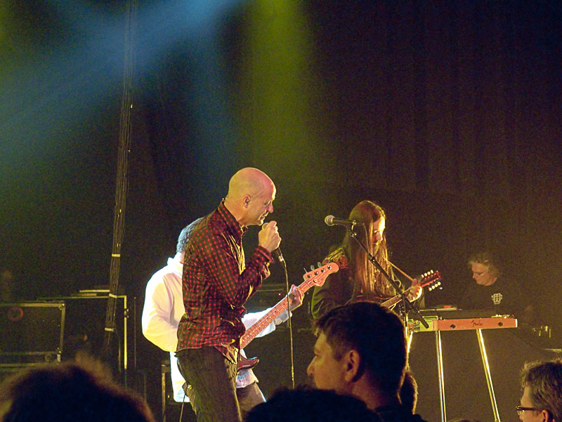
I carried the F550 with me the last few days and thought I’d show the stuff I’ve shot. These are snapshots, so don’t expect any kind of art. This is the stuff that mom and pop (and I) shoot just for fun.

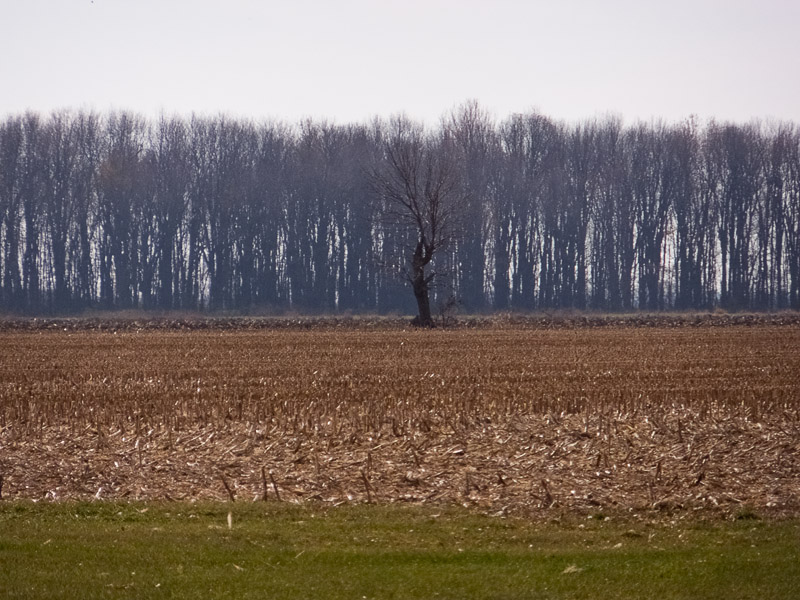
So, on the way into work on Wednesday, I took a route that brought me past this corn field, which was just cleared a few days before, leaving a clear view of a small tree that I call “The Sentinel.” I’ve shot it many times with many lenses and bodies and thought I would shoot it again with the F550EXR and see how RAW came out.

Well, I managed to have a world-class brain fart while shooting it and my ISO was stuck at 400, a bad thing when it is not needed. Since the camera was in P mode, it was forced to choose f/11, which is not a big deal as that aperture at full zoom is implemented by an ND filter, and therefore does not affect diffraction. The depth of field, however, is approximately equivalent to a full frame camera set at f/63 … so there is no issue getting everything in focus.

The Sentinel is several hundred feet away from me here, and the stand of trees is at least another hundred feet behind it. It turns out that the acuity of the image is not harmed all that much by the ISO, so I quite like this rendering.


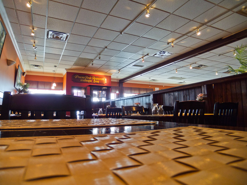
I later met a friend for lunch. He moved to another division a few years ago and works in a different building, so we met at the local Phnom Phen restaurant, an excellent spot for Cambodian / Thai curries.

On the way in, I noticed this Corolla in the parking lot, and just had to capture the cool lettering on the back.

One would consider that a warning to potential suitors Smile

The restaurant was pretty empty when I arrived, and I caught my usual indoor image from my usual table … you’ve all seen this scene before … ACR handles the distortions very well at 24mm, and I don’t find that I am fighting lots of blur or anything, although the details in the corners here are too close to be in focus.

Steve opened the bidding with the C6 dish, called “Golden Chicken” and he ordered it spicy, which generally means that your mouth hurts for a while after the meal. I raised him a C6 with beef, and he called. So two C6 beef showed up a while later …

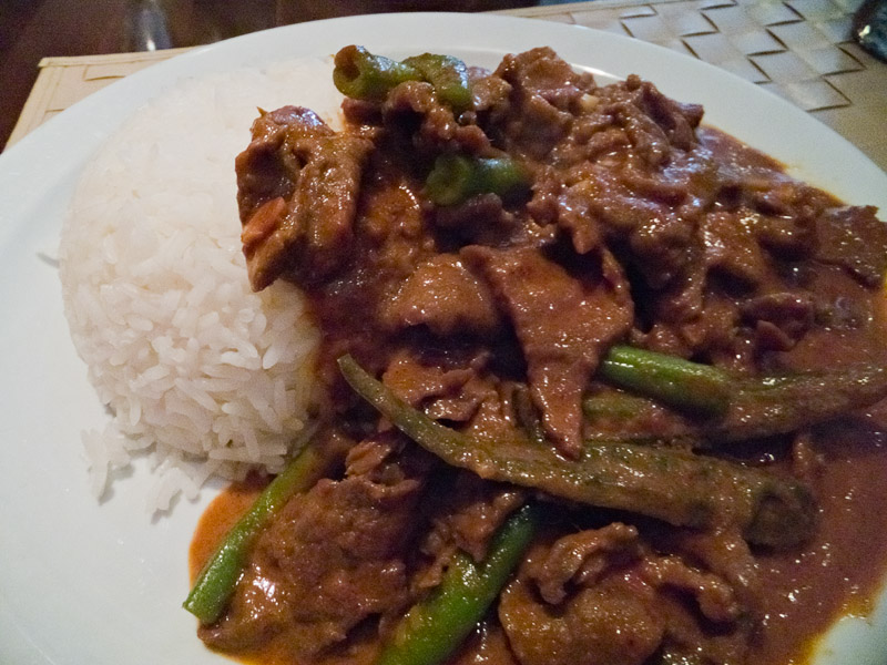
Tender, thinly sliced beef with Jalapeno slices and green beans in the tastiest curry you ever had. I think there are chopped peanuts as well, so it has a hint of Satay about it. Awesome does not do it justice.

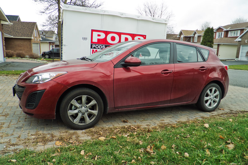
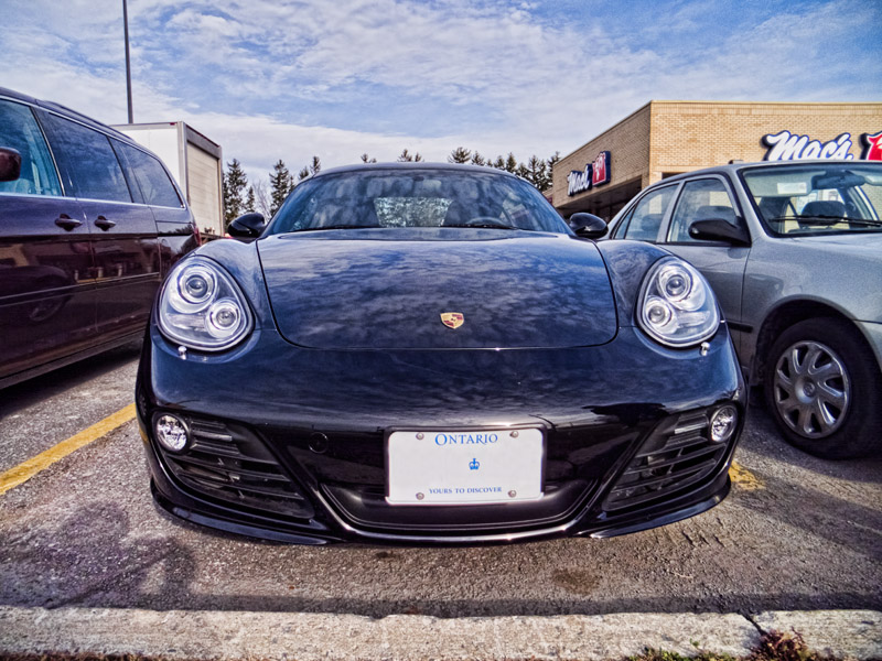
So after chatting about various subjects (we have a surprising amount in common), we both had to split to get to our next meetings. As we walked out, I noticed his new car parked right beside Apocalypstic so I shot it from the back and the front. It’s pretty nice, for a car that is worth a mere hundred grand. This is something we do not have in common, my was was about 1/5 the cost new. And I suspect is much less pleasant to drive.

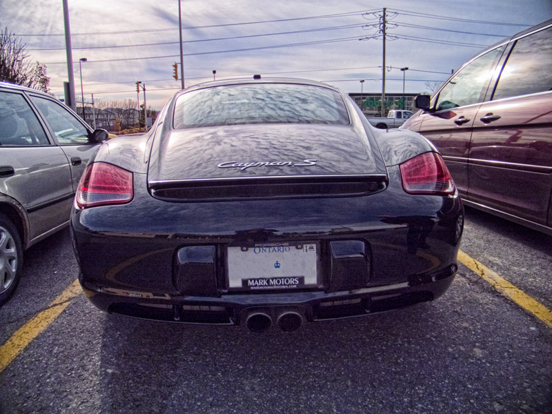
That’s Topaz Adjust 4 working the pseudo-HDR look. I prefer this style for cars as it draws out details and creates a lot of depth in the paint that is otherwise not there. In other words, it makes boring car shots something that can hold the interest a few more seconds.

Of course, from the front, it is even cooler.

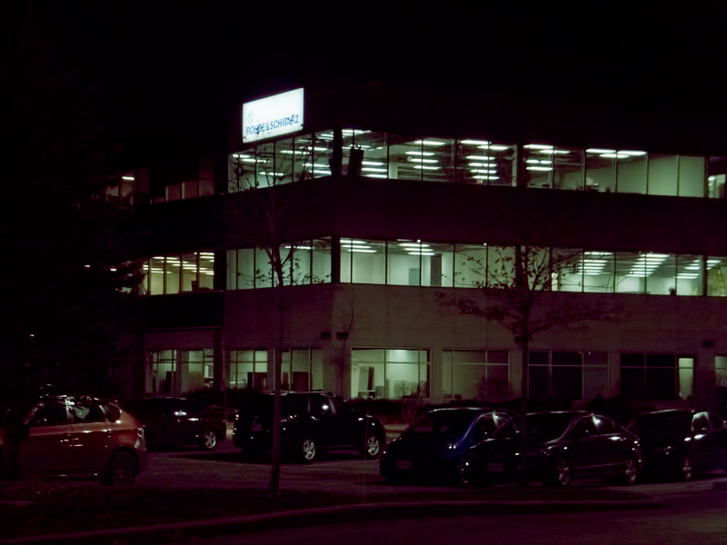
Later that night, I noticed for the first time that our sister building had been invaded by the company that used to be the dominant tenant at 550 March Road back when I was general manager and engineering director at e.mediate networks ltd, a small startup that built a pretty impressive VOIP switch that spoke and listened using SOTA speech technologies. Anyway, Rhode & Schwartz was the tenant whose name was on top of the sign and we, as a small startup, were at the bottom of the sign.

Here, they obviously have taken a substantial portion of the building to get a sign that prominent.

So that was yesterday. Today, I arrived for an early meeting and saw the police training on several motorcycles. They were doing pylon stuff, zigging and zagging away. When I pulled in a parked, they were having some sort of meeting way out in the lot.

Of course, another brain fart caused their yellow jackets to blow out in the sunlight, so I had to process this as a B&W, which I think looks fine for what it is. I.e. a snap shot (remember that I never purport that I am an arteest.)

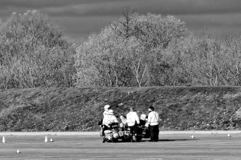
This B&W conversion was done with the image->calculations… menu item. This thing lets you mix the RGB channels in monochrome through various filters and with some or all inverted. I generally use the red filter twice and then blend with a mask set to red filter but inverted. This creates a high contrast image that can be quite pleasing. I further adjusted contrast though on the above image.

I had a long, long meeting this afternoon with an eclectic team of people to work out a pretty fascinating way of xxxxxxxxxx xxxx xxxxxxx xx xx xxxxxx xxxx xxxxxxxxxx. Nuff’ said, since revealing any more requires that I hunt each of you down and eliminate the leak. Here, though, is a sneak peek at a future feature that will blow your minds …

DSCF5870_board

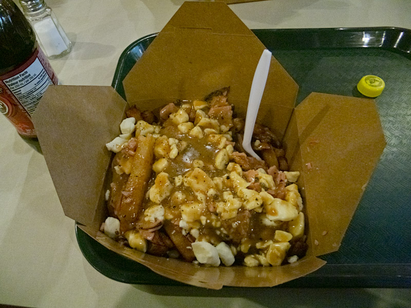
Later, the boys and I thought we’d try a new local restaurant calls SPUDS, which is owned by a friend we have known since 1990 (the year my youngest was born.) He built a rather large empire of pizza shops all over southeastern Ontario and eventually retired. Now, he’s come back with this fantastic establishment, partnering with a family member to create the best Poutine experience you will probably have in your life.

This is the Montrealer, a Poutine with Russet potatoes from Quebec, real cheese curds, rich beef peppercorn gravy and chopped smoked meat. To die for (and yes, it is obviously a heart-attack in a box – get over it) …

For those who are curious, these indoor shots are mostly 3200 ISO images, and it makes me chuckle when people on a certain photography forum talk about the new Fuji X10, a marvelous camera by the way, as “good to about 400 ISO” and such. Talk about confused …  this little 1/2” sensor makes images that look terrific here and would obviously make perfectly good small prints. So the much larger sensor on the X10 will have no trouble getting excellent 3200ISO images indoors.

Here are a couple of shots of the outside of the store. The first is shot at +2/3EV to emphasize the inside of the store, and the second at –1EV to try to preserve the red sign.


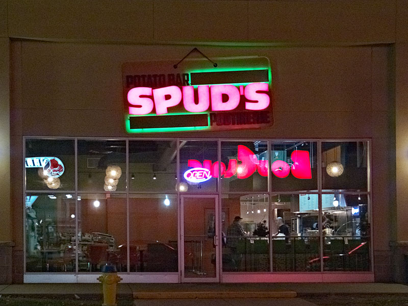
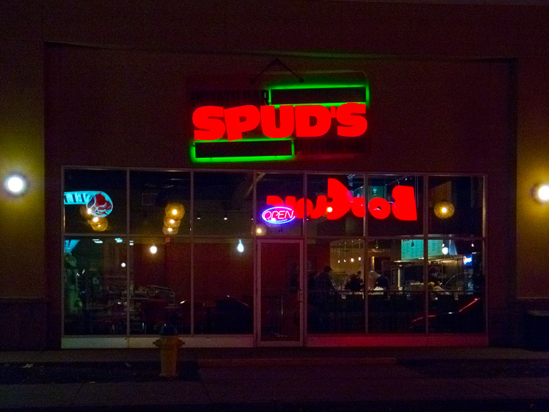
Obviously, you should always, always, always shoot at –1EV if you want to save your highlights at night. The camera is trying to raise the whole exposure to mid-grey because the scene is dark, so the light will blow – in this case the red channel specifically – and you probably want to prevent that. By shooting at –1EV, I can then raise the shadows a bit in ACR and I get a nicer overall look …

So that was the last two days. This camera remains a ton of fun …