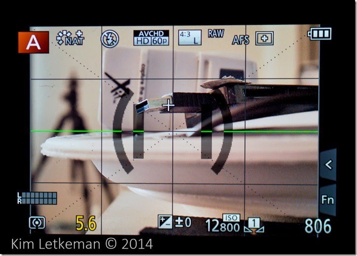
There was a recent thread on DPReview where the pinpoint focus on the GM1 was being discussed. I read it with interest, since I was finding the same annoyances in the GM1’s firmware. That being that the techniques that work on other Panasonic bodies like the GF3 are still specified in the manual for the GM1 but do not work … so people were doing all sorts of strange things to get back to the center. The obvious choice is to simply press the LCD in the center, but it is surprisingly difficult to get anywhere near center with that technique.
In testing it more thoroughly, it turns out that there is much more to this than meets the eye. I made a video on the re-centering technique that is used for thr GF3 and the GM1, do if that is all you want to see, then just watch this:
Pinpoint Focus has been rethought as a feature, though. While the obvious part of the user interface – the crosshair – appears the same, how it actually works is very different.
First, let’s explore the GF3’s interface and then see where things have changed.
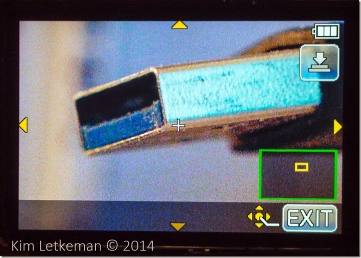
To start off, you simply click where you want to focus. This works well enough and you get a magnified view while it focuses … like this:
The room is somewhat dark, so you end up seeing some noise in the image on this screen (which is also magnified) … not to worry. The images look fine.
Note the arrows. You can drag the entire image around and it will show you when you bump into the edges. The inset also shows you where you are in the overall image. This works very well, although the pressure sensitive screen is not as responsive as you might be used to on a smart phone or a newer camera.
Resetting it to center is a trivial matter … you just press the screen to make sure you are in magnify mode as above, then press the “disp” button. And you can see by the inset that the pinpoint has centered itself on main screen.
And there you have it.
The GM1 does not really work like this. Many little things have changed. I have written in the DPReview thread and indeed commented in the video above that I thought this was some kind of brain fart on Panasonic’s part. But using it for a while leads me to believe that they have simply changed how it works. It is different enough that it makes no sense at first, but once you get used to how it works you start to see the value of the new methods.
The basic interface is the same. Touch where you want to focus. The background here is less blurry because I am shooting the kit lens at 32mm instead of the Sigma 30mm 2.8.
You can see that I have touched the same point but because this camera is a bit shorter, the crosshair is not in the same place, but rather is more centered. Still, it is off dead center and that’s what we want.
The real difference here is in how things work when you go into magnify mode.
As you can see, I have made a slight change to the pinpoint setting where I have chosen PIP (picture in picture) mode here, but this is trivial to change so it makes no real difference. Note that the inset is smaller, but still shows where we are overall. Note also that the arrows on screen are now clustered around the crosshair and not on the edges. This is because dragging the screen no longer works. Now you drag the pinpoint within the magnified area.
This is actually very useful as it is much more responsive than dragging the entire image, especially on the lovely capacitance screen (assuming that you are not trying to work with gloves on) … and the arros show you when you hit the edge of the allowable focus area. They disappear as you touch the edge, obviously indicating which edge you touch.
Since you can change the magnification from 1x to 10x in increments, this can lead to some seriously precise work. So I think that this is a reasonable change.
But the tricky part comes when you want to recenter the crosshair. The disp button still works, but it only recenters within the currently set PIP area. So you can move around all you like in magnified mode, but recentering does not work here.
So what do we do instead? Well, you click the left side of the ring dial, which is focus mode. That puts you here:
Now you touch AF Area there at bottom right and you see this:
Now you are being shown a new look … the 4 way arrows showing the magnified area within the overall screen. This is where you touch Disp. Reset at bottom left or click the Disp button on the body (button at bottom right corner.) This immediately recenters the pinpoint …
And touching the shutter button (half press) or touching Set at bottom right puts you here …
This is a bit ugly when compared with the GF3’s very quick way of resetting. But it really is just one more click. And for that price you get a much more responsive pinpoint interface.
I think they could have just left it the old way, with disp in magnify mode just recentering the point on the main screen as with the GF3, but one supposes they have use cases that made this seem like a better choice. I know that you can hand a user interface problem to ten developers and receive ten solutions, of which 9 or 10 will suck … so this is actually a decent result :-)


