Thursday, February 16, 2012

Fuji X-Pro1 – very impressive sample images …

Someone posted a link to the site http://LensTip.com where there are a number of sample images for the new Fuji XPro-1, a pretty amazing interchangeable lens camera with a new sensor that appears to seriously rock.

I’ve seen some of Hugo Poon’s initial images, as he often posts images before cameras are released, such is the respect Fuji accords his excellent photography. Click that link to see just how marvelous his work is with this camera. This is a real step up for him … I like his new images better even than his images with the Fuji S5-Pro. The XPro-1 is a much better camera I think, despite its lack of dynamic range extension tricks.

So … back to Lens Tip’s excellent images. I will examine one of them here, calling on the Fair Use Doctrine to allow me to use one of their images for educational purposes. I will not, of course, post a full sized image, just a smaller version and some crops.

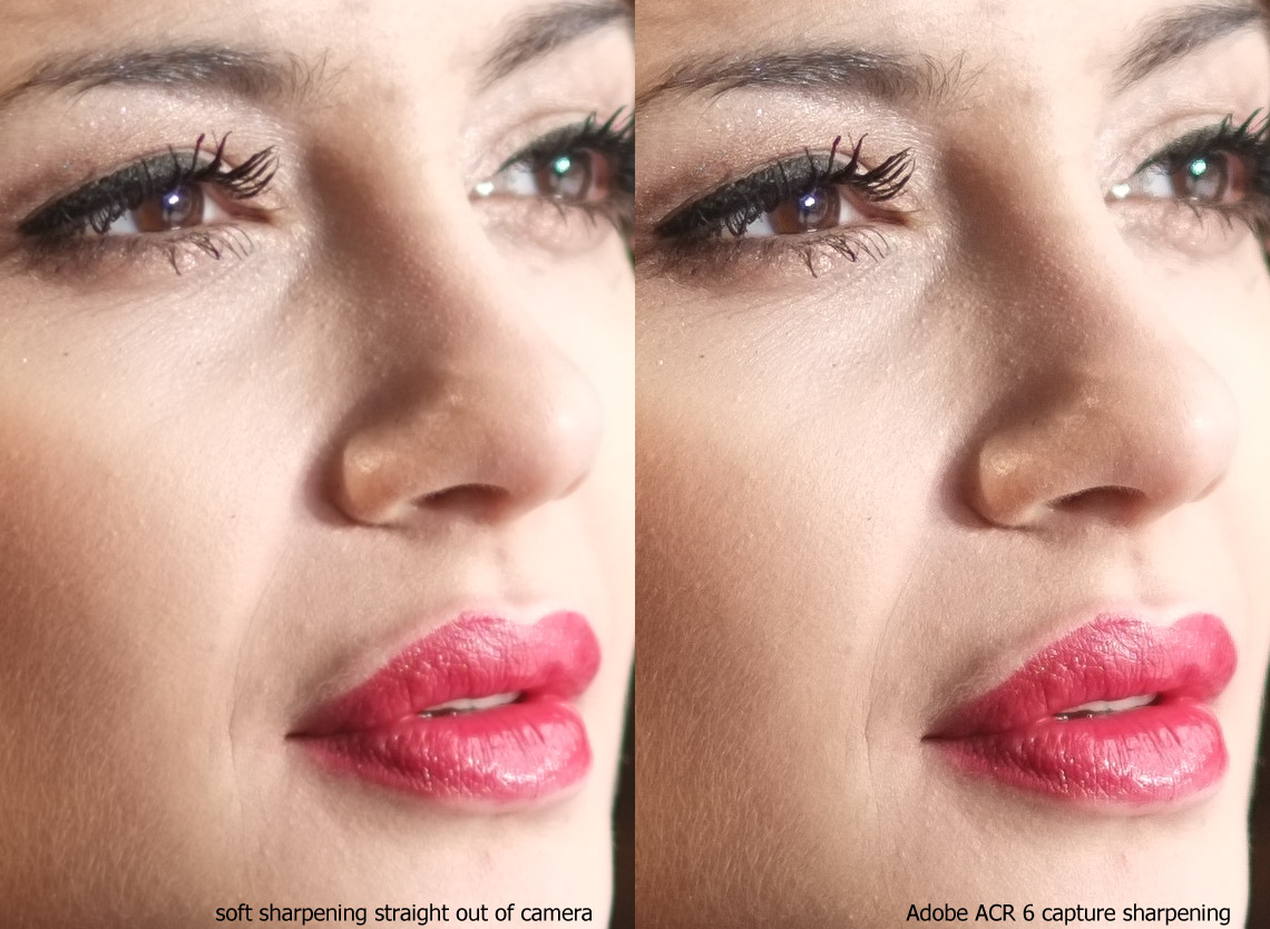
That image is magnificent. At base ISO, there is no noise to speak of, the tones are rich and the gradients are perfectly smooth. The sharpness is magnificent. In fact, I put together a pair of crops to show the extreme high quality of this camera’s lens, sensor and jpeg engine.

Click through on that image to get the larger version. You will see just how outstanding the sharpening tolerance is for this sensor and jpeg engine. A far cry from the weak EXR images from the X10. The X100 competes, but I never got the razor sharp sense from that camera that I see in this one.

And it was shot at f/1.4! With sharpening on soft! Amazing …

One thing I don’t like so much … I’m not fond of lipstick that does not cover the whole lip. I am sure that she must be compensating for a perceived dislike of her very full lips, but I think she should really consider using the entire area to the ridge. Not only does it balance the thickness of the top and bottom lips, but it shows a fullness that many stoop to Botox to achieve. She has it naturally …

Just my opinion of course …

I wrote a joke …

There are synonyms – words that have similar meaning.
There are homonyms – words that sound alike but have different meaning.
There are antonyms – words that have opposite meaning.

But what about words that sound similar, have different meaning, yet a subtle relationship actually exists if you look hard enough? What should we call these?

Case in point: incompetence versus incontinence.

When you are surrounded by either, everything seems to turn to shit.

Say hello to my little kitty …

Tuesday, February 14, 2012

Lightroom 4 Beta 1 Drives me Squirrely

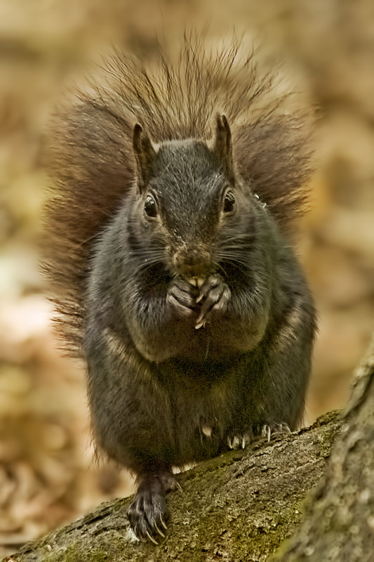
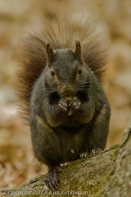
I spent some time exploring my older images. Lots of fun to redo several of them. As I hit the 2007 summer walk around Mud Lake, I recognized a favorite squirrel image. Shot with the fantastic 300 f/4 AFS and TC17e at 510mm, it is a fantastic rendition of the animal. But this was also a 4Mp Nikon D2Hs professional body with a pre-CMOS LBCAST sensor of Nikon’s own design. The camera was amazing when light was added, but shadow noise was always a problem.

I have gone back and reprocessed the image several times over the years and I could not resist another shot at it with Lightroom 4. So starting from the beginning …

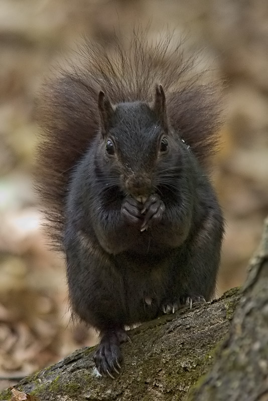
My first attempt might have actually been the best attempt. It certainly has very nice long fur on the tail and the shadows are not too obtrusive on my Dell monitor. But on the much brighter acer TN panel, the belly looks rather smudged and noisy.

The EXIF for the image is: 800ISO, f/6.7, 1/30s

Image number 1 was processed in CS3 from RAW.

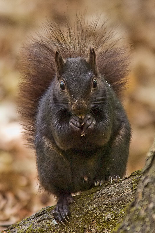
Attempt number 2 brightens things considerably. Also processed in CS3.

The fur does separate much better from the background, and the overall tones are more pleasant to me. His little hands and feet and the tail are really well defined. But the heavy grain on the belly is unmistakable.The tones are just too open.

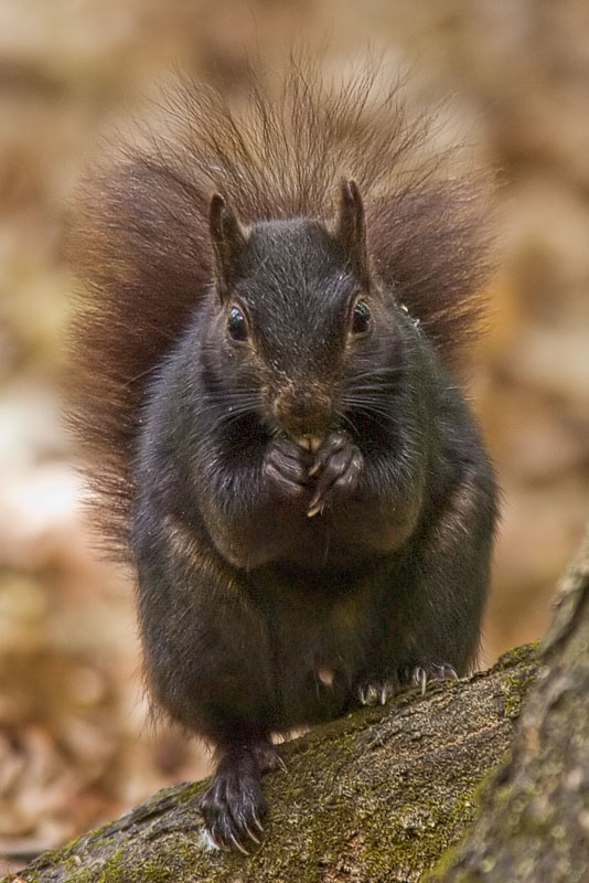
The next one is a similar attempt to #2 bit with more attention paid to the belly area.

Now that one is a huge improvement over #2. Mainly because of the more subtle sharpening. The grain is much better controlled. Still CS3 by the way.

Of course, I needed to try one more time … and this one is almost cartoony. The main difference here is an excessive use of the Digital Outback Photo detail plugin. I forget its official name, but it was free and it really sucks detail out.

There is no arguing with its ability to show details. This is actually not bad … but I get a sense of smearing that I cannot shake. It is subtle but my visceral reaction is not all that positive. There are also nasty shadow artifacts around the belly area and the leg creases. I just don’t like this very much.

And finally … Lightroom 4 Beta 1 with the 2012 image process.

Now that’s more like it!

The fur looks like fur … soft and silky, yet detailed. The belly is not grainy and there are no nasty artifacts. The hair of the tail looks very fine. All in all, this is easily the best of the bunch. And what amazes me is how easy tones are to control in Lightroom 4. They say that this version is very “twitchy” … with small movements of the dials making big changes. And they are very right about that.

But what I like about that is the ease with which you can see the changes and back them off. I love that …

So … Lightroom 2012 is going to be a winner in my book …

Monday, February 13, 2012

Seagate® Expansion™ Drives – Serious problems at this time …

This might be a post-Thailand flooding issue. The 2TB drive is a very good price (by today’s standards) at Staples.ca right now … $139 on sale. So I picked one up to augment my older 1TB Seagate FreeAgent™ backup drive. It is down to only 14GB free, which is one serious shoot. So it’s desperate times.

The drive I bought is:

image

That is from the Seagate site, and note the very light printing. This is no longer available. No doubt the cause of the sale.

The drive has an overall user review of:

image

But that is extremely misleading. This year’s reviews are all terrible. Mostly 1 star with a small number of higher ratings. The reason is that these things are fragile. Mine is DOA. It powers up but will not connect on USB 3 or USB 2 ports. This is common, even when it initially connects. Apparently, just unplugging and replugging is often enough to snap the port’s connection.

So … avoid at all costs, even on deep discount. They have now brought out the 3TB version (likely wht the 2TB is discontinued) and my guess is that this is one to avoid until the tide turns on the reviews. But we won’t know for months …

Bummer … Seagate is my preferred brand. Now what do I do … LaCie? Much more expensive, but there is almost certainly a reason for that …

Update: I ordered a wonderful LaCie LAHDDP2 2TB F.A. Porsche Designed Desktop Hard Drive from B&H Photo as the price was amazing for a drive of this quality (5 star reviews everywhere and LaCie has always been a high-end manufacturer.) For 150, I get a 2TB drive with USB3. Users say it is truly silent. And reliable. We'll see I suppose. Shipping to Canada only added 10 bucks and taxes and duties were about 2 bucks more than an equivalent price here for taxes alone. Great deal. The other drive that was also inexpensive was the LaCie Minimus, a much smaller drive. I chose the Porsche because it appears to claim slightly higher throughput. Rather high, too.

Sunday, February 12, 2012

Nikon E990 versus Fuji F550EXR with Adobe Lightroom 4 Beta 1

Ok, I’m kidding. In fact, I shot a few images at breakfast with the F550 and I went browsing through my historical files for a while this afternoon using Lightroom’s excellent organization of my files. It’s already pretty clear to me that I’ll be buying LR4 when released, but don’t tell Adobe as I’d like to see if they offer discounts to beta users :-)

Anyway … a couple of shots from breaky … first, Nick is chatting while we are waiting for the food. We jumped the queue by 15 minutes because we were willing to take a tall table inside the bar area, which is next to the crowded intake area. The answer is to ignore that and grab the table.

F550EXR  800iso  f/4.5  1/60

And then the wicked breaky arrived … mixed lighting forced me to desaturate some of the blue, which I think made the less toasted bread look a bit wonky. Oh well …

f550exr  640iso  f/3.5  1/30

So the F550 acquit itself rather well. I am really enjoying Lightroom and all the fine grained control I have over the tones and colors. Although ACR is pretty similar, I find this method a bit more approachable. And more importantly, I really like the way their 2012 engine does things over the 2010 engine, which itself was much better than the 2003 engine :-)

So on to the E990 … for those who don’t remember what that was …

cp990.jpg

Browsing along, I stumbled on a set of images that I always liked. These were taken about 12 years ago in the summer of 2000, so they are on very early CCD technology. And my skills as a photographer were really, really, weak. Anyway, I blew this image out completely, yet it works just fine in black and white … or, more accurately, as a split tone (duotone) …

Note the exposure … although the image looks very bright, it was shot in the late evening with an incredibly slow shutter speed.

Nikon E990  242iso f/2.5  1/3 

The following image is part of a short series I called “bug love” at the time. Jon saw me processing it and mentioned that he remembers it vividly. The boys and I used to have our computers together in a pseudo office (my attempt at supervision) and they watched me process these on Photoshop 7 back in the day. I had a print displayed on the wall of the room for years.

Nikon E990  100iso  f/3.3  1/25

That was another late evening shot, hence another slow shutter speed.

Next, I was looking over the photos of the trip my sister “T” and niece “C” took to Ottawa that year. We went up into the peace tower at sunset … a beautiful view … and before the sun actually set, I looked out towards the North (that is Quebec across the river) and shot the beautiful Library of Parliament, the only structure that survived the fire that destroyed the last Parliament buildings during WWI on 3 February 1916.

The tones are surprisingly subtle, something that Lightroom really helped me to exploit.

Nikon E990  100  f/2.6  1/45

Lightroom turns out to be really good at pushing saturation and vibrance to accentuate beautiful subset colors. The following images are much more colorful than they were when captured, yet I did only global changes to them in LR4.

Nikon E990  100iso  f/5.6  1/120 

Nikon E990  100iso  f/7  1/220   Fluorescent WB

The fancy use of fluorescent white balance was in fact a brain fart, I am quite certain. Anyway … I particularly like the last one because the break from blue to orange is real. The cloud bank happened to be sunlit on the bottom and it happened to perfectly divide the sky. So I cranked the color up to 11 …

Conclusion: I know I didn’t call this a test or anything like that, so the conclusion is to what? Well, I found the E990 a bit cumbersome to process because it was jpeg only and they are small. Sharpening is pretty hard, so I really need to take them into Photoshop and add a pixel or two of Gaussian blur to counter that.

But all in all, I find these images very nice. This camera was an excellent image creation tool in its day … people should try to remember that we have had excellent digital cameras for well over a decade now, and it is actually our skills that determine what our images look like no matter which camera we are shooting.