The Fuji HS10 appears to be the company’s flagship bridge camera (dSLR look-alike with similar controls) these days. It is based on the Sony BiCMOS back-lit sensor and thus is able theoretically to handle night scenes much better than cameras based on previous generation technology. Backlit means that the light strikes the back of the sensor and gets captured without passing between all the wiring etc. … which means that the photosites can be a bit larger, thus improving noise and dynamic range.
It is not actually clear at this time whether the HS10 really achieves such lofty goals, but the fact that the HS10 is also able to shoot in RAW mode makes all these claims less relevant to those trying to capture a lot of fine detail, say, for landscapes. Shooting RAW means that you can process the image without any real interference from the camera, and so you can apply any kind of noise reduction or sharpening and can tune the image to your goals. Big difference from jpeg.
Fuji ships a RAW converter, made by a company called Silkypix. The reference is obvious … silky smooth and all that. It seems like a pretty good converter, but of course to preserve all the detail you get, you must run a conversion to 16bit TIFF (huge file) and then reopen it in CS5 for processing. If you instead use Adobe’s built in converter – Adobe Camera RAW, or ACR – you get the benefit of working in memory for the entire trip and only saving to a larger format for those images you want to preserve for later output to multiple potential formats. Transferring from ACR directly to CS5 in 16 bit, aRGB mode is a real improvement in the work flow.
So it is well worth examining the difference between these two. And this has been done in a pair of articles on the blog http://eyemindsoul.blogspot.com. These articles present a long series of side-by-side comparisons in part 1 with some documentation on settings in part 2. The conclusion documented in part 1 is very favorable to Silkypix, and indeed the images from that converter so look better. But I feel that the method was flawed.
Two fatal errors I noticed up front:
- First, there was no attempt to equalize tone, color or sharpness in the conversions process. The images that get imported into CS5 look very different. This essentially invalidates the rest of the comparison.
- Second, each was eventually sharpened in CS5 using the same settings. Yet since the conversions were not equalized, sharpening should have been altered to bring each to an appropriate level of sharpness. There is some mention in there of using a rather blunt set of USM settings on the ACR image, but this is very unsophisticated and was not a valid equalization attempt.
So … this article is an attempt to identify the differences between Silkypix and ACR and to see what sort of difference we might see in the final output. Here is the method I will follow:
- Get a good image in Silkypix. This is Fuji’s converter and so it should be pretty easy to get a good image. Note that I was not disappointed at all.
- Using ACR, and comparing top the Silkypix version constantly, attempt to get an equivalent image from ACR. Answer the question: what settings are needed to match the Silkypix settings?
- Illustrate differences with 100% crops.
- Show the final results. How different do they look?
And that’s it.
Note that I will go for one good image from Silkypix. Since there are many possible settings, each with a large range of values, I had to explore the interface a fair bit and then make my choice of the best settings to get a nice landscape image. This allowed me to narrow the target for ACR down to one look. Any other method opens an exponential combination of comparison images and becomes pointless.
Note: my primary objection to the other articles is that two seemingly different-looking images chosen from the many millions of combinations of settings from their respective converters cannot possibly make for a useful comparison. Without an attempt to equalize the images in some area, they are effectively random images. And since all the settings interact with each other – we’ll get to that shortly – tweaking one and getting an image that looks quite different only says that these two images are possible. Which is really saying nothing at all where comparability is concerned …
The Images
So let’s look at the image we’ll work with. It is copyrighted © 2010 by Dave Lloyd and is used by permission. (Dave actually challenged me to perform my own comparison and posted numerous RAW images for that purpose.)
Here is an ACR conversion at pure default settings. It’s actually not horrid or anything, but the background is rather mushy (not at all pretty at 100%) and the distortion is stunning. Look at the curved horizon below the mountains. That’s not a hilly section of land … that’s barrel distortion.
As always, click through for the 800px versions. These display everything with much greater clarity than you get at 500px in the blog.
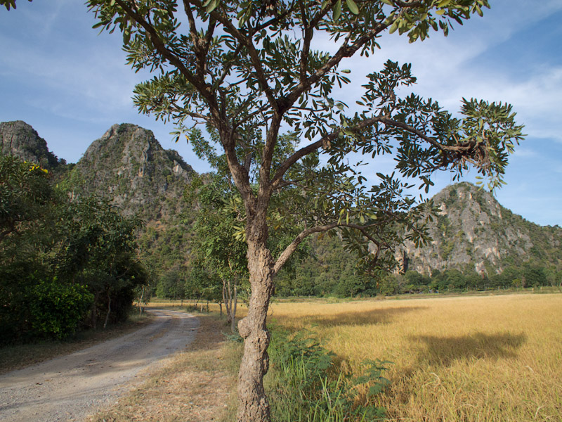
When I loaded this into Silkypix, it was immediately obvious that the converter was correcting the distortion. Here’s that version for comparison purposes:

The horizon is straight. The colors are much richer in the greens, and there is a very nice sense of detail in the background. Kudos to Silkypix and Fuji for the very nice marriage between the camera and the converter.
Now, could ACR possibly get close to this excellent result? Well, the answer is yes. It can almost certainly get extremely close, allowing for tweaking of the response of individual color channels etc. I.e. creating a camera profile to match that used by Silkypix. I’m sure that you can imagine the effort required to do such a thing. I don’t have the time nor the skills and tools (e.g. Gretag MacBeth color chart) to perform the calibration between these at that level.
So instead I was going for close, but not almost exactly the same. To get close, I had to tweak a lot of settings as it was. And one thing I will be able to illustrate is that Fuji and Silkypix are using a lot of localized processing in the converter. Local contrast versus global contrast. Local sharpening too. They are pumping in the Fuji greens, despite this being a generic Sony sensor. So please do note that ACR is trying to match Fuji colors that are software generated, not colors that are an inherent property of the color response of a Fuji sensor. This isn’t all that important, but just something to keep in mind.
Let me introduce the ACR version before I get into a lot of details.
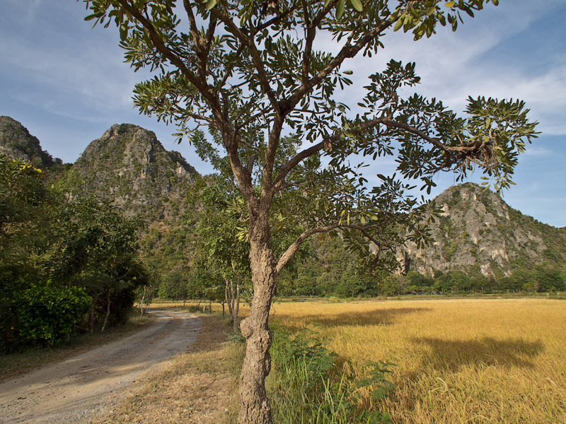
Some obvious differences from the Silkypix conversion that show even at this small size:
- Sky color is muted a bit.
- Greens are not quite as rich.
- Slightly less global contrast.
Believe it or not, this near-miss was the product of something approaching 50 separate conversions, each with one or two changes to settings. I had to sneak up on the tone and color and never quite got it right. Again, I am pretty sure that Silkypix makes a lot of localized changes. But there are also areas where my color-blindness makes it impossible for me to get closer. I have no intuitive ability to immediately spot the appropriate tweak, so it’s all about measuring what CS5 says is there against what it says is in the Silkypix image and then postulating the appropriate change to the settings. It’s also about balancing the kind of change that might make things more similar. For example, you can lower contrast with the contrast slider, or with the fill light slider, or with the recover highlights slider, or with a curve. Lots of options and they all interact. Is your violin playing for me yet?
Conversion Details
Silkypix is very easy to work with for the HS10. At least, I found it very straightforward. The settings I chose are shown here:
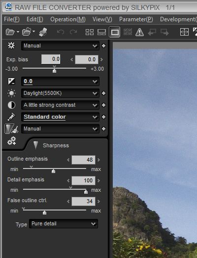
You can see here that I made the following choices:
- Exposure bias at zero
- Daylight white balance
- Contrast setting used “a little strong” preset
- Standard color – the settings in Silkypix were not named very much like Fuji film modes, which I think is a mistake by these companies. Standard seemed nice though, so I left it there.
- Manual sharpness adjustment – these are the only settings that I adjusted from the preset. I wanted to get good trunk detail on the tree in the center without adding any halos to the leaves against the sky. Turns out that you have to choices for sharpening algorithms: pure detail and normal sharpening. The former is more sophisticated according to the manual, and I used it. I checked the latter and it created huge halos in the sky, leading me to dismiss it as a too-blunt instrument. Sort of like most peoples’ use of USM.
That’s really it. I did not see anything to change in this image as the tone and color looked very nicely balanced to me. Sharpness was very good as well.
Now to try to match this look in ACR. You already know that I did not match it outright, but when you compare crops, you can see that I did not miss by all that much, considering the potential differences.
With ACR, which has a lot of panels and many sliders on each, we start with exposure, tone and color. Here are my final setting on this panel:
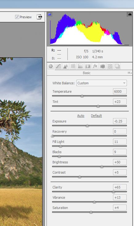
You can see that I had to change the white balance from a simple daylight setting. I needed slightly more warmth and increased the temperature to 6000. Although I experimented with recovery as a means of handling contrast, I ended up not using it at all. I used a touch of fill light to open shadows slightly. I moved the black point slightly to match what I saw in Silkypix. Brightness was left at the default value. Contrast was constantly adjusted until I arrived at this fairly conservative value. A bit too conservative I think, but boosting it any more changes tone too much. And I cannot change blend modes in ACR.
I dialed in a lot of Clarity, which made a lot of difference to the background. Here is where Silkypix and Fuji are really working it. They obviously use a great deal of local contrast processing in their fancy sharpening algorithm. I boosted both vibrance and saturation (just a bit) and still fell short in the greens. I finally gave up and left it, as tweaks were not working. I will have needed changes to individual color channels, and that takes more time than I was willing to give. Plus there is the color blindness (cue violins.)
Note that I bounced back and forth between panels, tweaking related settings over and over to arrive here. You are getting the final summary in order by panel, but that’s not how I experienced it. It was more like torture.
The second panel after basic is tone curve. I left that alone, although in retrospect, I wish I’d played with the parametric tone curves a bit … I would have liked to leave the sky alone while tweaking contrast in the trees and mountains.
Panel three is detail, which of course offers four sliders for Sharpening and five for noise reduction. Here are my settings:
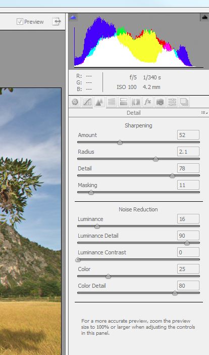
You can see that I kicked sharpening up pretty high to match the relatively strong sharpening in Silkypix. I boosted the radius a lot, and hit the detail slider very hard. I left masking fairly light, which allowed more noise in the sky than I usually prefer, but Silkypix had an equivalent amount of noise, so I was not concerned.
For noise reduction, I dialed in a small bit of luminance NR with a high degree of luminance detail, and I left color NR at the default with a high amount of color contrast. These settings have only a nominal effect on the result, though. The sharpening settings were what it took to match Silkypix.
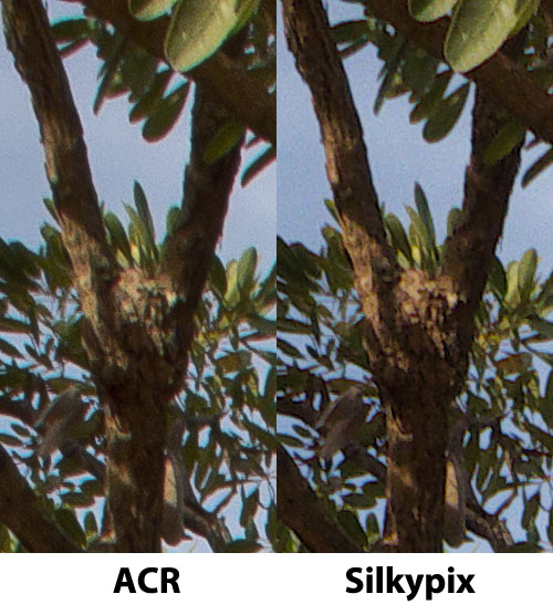
Now, it was not possible to match Silkypix’s sharpening characteristics perfectly because there appears to be a significant difference between sharpening shadows and highlights. To illustrate, I’ll introduce the first pair of crops. This is a crop from the tree trunk in the center of the image, showing the trunk in shadow and in sunlight.
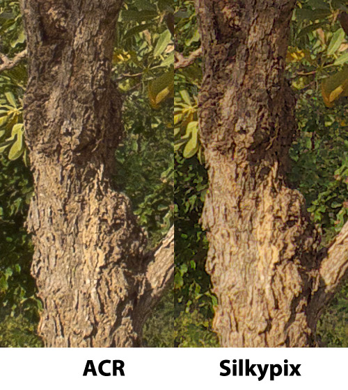
What you should notice here is the fact that the sharpness is uniform between the shaded and lit sections of the trunk. But in the Silkypix crop, the shaded portion is sharper, with higher local contrast than the ACR image. Yet the lit portion of the trunk is less sharp with lower local contrast than the ACR image. This can only be explained by the presence of selective sharpening and / or selected noise reduction in Silkypix. Of course, I would expect it to behave in the opposite manner, so I’m rather perplexed. For sharpness in foreground objects, I much prefer the more predictable behavior of ACR here.
Moving along. Panel 4 is HSL / Gray scale. Here, I allowed myself a bit of a tweak of the greens and yellows to try to approach the “enhanced” response of the Fuji in these channels. And by enhanced I mean exaggerated :-)
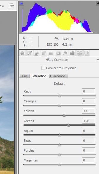
That seemed to help quite a bit, and allowed me to back off the wild saturation and vibrance settings that were throwing everything else off.
I skipped panel 5, split toning, where shadows and highlights are separately tuned using hue and saturation sliders. This might actually have been the secret sauce to a somewhat better match, but I don’t have any skills with this panel yet. So I suffered without this panel’s abilities (cue violins.)
On the other hand, panel 6 – Lens Corrections – got a real workout. You can see for yourself the massive distortion in the middle of the frame, and it ended up taking a spectacular introduction of +43 pin cushioning to counteract the incredible level of barrel distortion at 24mm. This is not unexpected on a 30x (measured in light-years?) focal length range, but it means that the pixels are being heavily abused before we even begin to work on the image. I also had to scale the image to 114%, which means we throw away around 1/7 of the image off the bat. This begs the question: “When is 24mm not 24mm?”
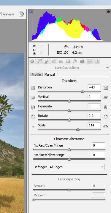
Note: There is, I believe, an HS10 lens profile that does this automatically. But it was fun and very instructive to figure out the amount of distortion that was present.
Also note that the crops show that the match of edges to my ACR version is not exact in all dimensions. The top and left sides seem identical, while the right and bottom sides are not. Since ACR is trimming equally on all sides when scaling occurs to handle the distortion correction, we can only conclude that the distortion is not linear in nature and that Silkypix is trimming the left and top more than the right and bottom. This is why we cannot quite get a perfect match in the final result pixel placement, although we get really close.
I skipped panel 7, Effects, as I had no need for grain or vignetting control. Panel 8 is the Camera Calibration panel. I set Adobe’s 2010 process, which I much prefer over the 2003 process, used in all previous versions of ACR. I also selected the Adobe Standard camera profile, the only one I have available for the HS10. It’s a good start, so not problem not having others.
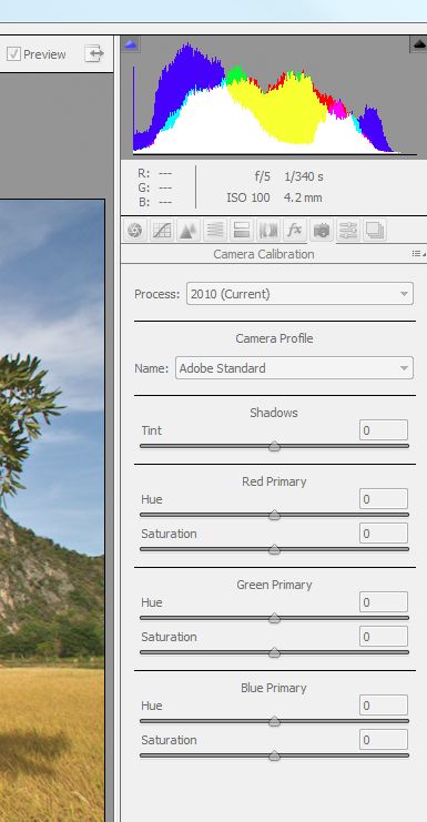
The keenly observant will notice the presence of the shadows slider, which allows me to tint just the shadows to a warmer hue. Well … I have not used that one before, and so I did not think to tweak that slider for the problem I had with the richness of the Silkypix shadows versus the ACR shadows. (Cue violins.)
The last two panels are presets and snapshots and have no bearing on the image.
So that’s it. A lot of tweaking here and there to get things to look similar. The background took a long time to come around, it being mostly mush at first. Of course, the clarify slider was where most of that magic was contained, as mentioned earlier. The colors were fairly hard to get close, but once I backed off the overall saturation and dialed in more yellow and green, things seemed to shape up in that area as well.
Again … I’m color blind. The readers will see much more difference in color than I can. (Cue violins.) So busting my chops over it accomplishes nothing. But if you would like to outline the actual color differences in a comment to this article, I would very much appreciate that.
Now …. let’s analyze some crops. You already saw the center crop, where ACR provided a good degree of sharpness and local contrast in both shadow and light, whereas Silkypix had uneven sharpening across that boundary for whatever reason.
Let’s examine the bottom left corner, where the road meets … well the road.
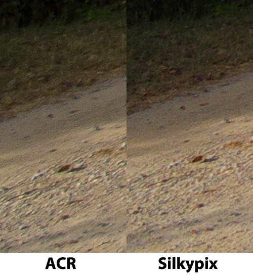
The ACR image has more luminance noise (grain) in the grass area. The pebbles on the road are slightly blurred, whereas Silkypix has the lens distortion taken care of there. Silkypix has performed some noise reduction and has rescued some more detail here. Note that these are tiny details and would only show up in massive prints, but it indicates a fairly sophisticated algorithm for NR / sharpening.
The next crop is a clump of grass against the bottom of the frame to the right side of the central tree.
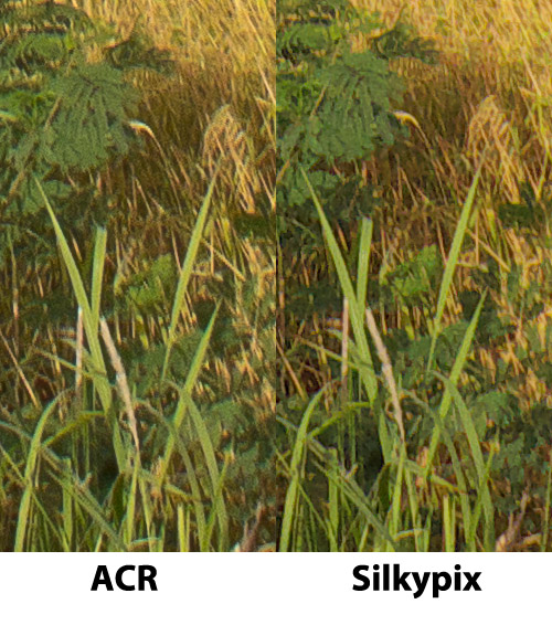
Again, a bit more noise in the ACR version, giving Silkypix the slight detail advantage. But it is so slight as to be irrelevant at any useful output size. These crops are otherwise as near identical as is possible.
Things always seem to get interesting near the edges of the image. Especially the sides, where the bulk of the lethal distortions are corrected. So the mountain at the left middle of the frame shows very clearly how much localized contrast, noise reduction and clarity is being applied by comparison to ACR.
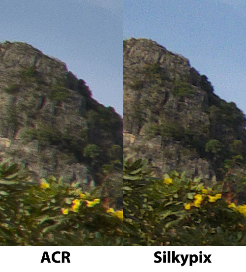
Silkypix looks better here and it is quite decisive. But remember that these crops are equivalent to staring at a 40” wide print from 20” away. A truly unlikely scenario for most people, so most people will never see this difference in real life displays of the image (web, small to medium print.)
Over on the right side, things are slightly better for ACR, although Silkypix is still better. This again underscores the unbalanced lens corrections that cannot be mimicked in ACR without a custom lens profile.
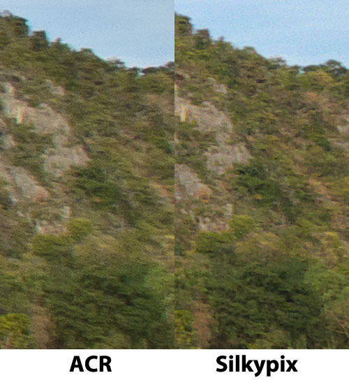
Again, the detail in Silkypix is clearer and has better local contrast. Custom processing in CS5 could fix that for the ACR image easily, but remember that this is strictly a test of the converters. No CS5 allowed.
The top middle crops are so similar as to require no comment, other than that the sharpening in shadow is again shown to be slightly stronger in Silkypix.
One last image … an animation showing the two conversions along with a default ACR conversion to clearly illustrate the spectacular level of distortion and the rather different tone and color that was where I started.

Were I to perform this conversion again, I would explore four areas in ACR further:
- Shadows slider
- Spit toning
- Camera profile
- Lens profile
But even without any of these, I found the ACR conversion to be quite close and perfectly adequate. Were I not going for a match, I would have boosted warmth even more. And of course these were strictly RAW converter outputs … CS5 itself offers myriad options for localized processing.
So if you want to shoot RAW and don’t mind the massive TIFF file, or don’t mind going straight to jpeg, then Silkypix definitely offers a useful set of presets. I like the output, and it is still slightly better than the ACR output, again bearing in mind that I was trying to match the two.
ACR did a fine job, though, and the differences are generally in how you reach the appropriate Fuji colors. Most people are inherently equipped to do this better than I can (cue violins) so don’t be put off by my inability to nail the colors in ACR.
If you have ACR, the work flow is far smoother into CS5 and you really should work on getting the colors the way you want them by default.
One thing is certain … Silkypix is not inherently sharper than ACR, Not even close. Both work well, but Silkypix has that weird shadow / highlight local contrast difference to worry about.
No comments:
Post a Comment