Yet another in an endless series of Fuji Talk Forum threads soliciting images was created today entitled “Simply Red” … post anything red. What a great platform for learning something new about photography and / or Fuji cameras … not.
So rather than post some image or another with something red in it (boring to be honest), I decided to create an image that met the theme. And what meets the theme better than the word SIMPLY in vivid red :-) ?
So here is my attempt …
Not bad, I think. So how was this done? If you don’t play much with Photoshop text, layers and blur I think you really ought to. You can do some surprisingly interesting things with only a few commands …
So let’s try to recreate this one …
Start with the CS5 (this should work more or less similarly in Elements, although I cannot say I know exactly which filters are available in the latest version of Elements) and open the File->New menu, which launches a dialog in which you will enter the size. I chose 500x500 pixels to match this blog.
Note that the background contents were left as transparent. This is just my laziness, as you can also set it to match the background color:
Obviously, you want the background color to be black then, and that’s trivial to do by hitting the “d” key at any time. This sets default colors of black foreground and white background. Just click the little swap double arrow to get what you want here:
Now, in my case, I leave the black as foreground because I must fill the transparent background with black. I use the bucket fill tool for that and click anywhere in the new image to get a black background:
Now, I click in the foreground color to set it to red. The dialog allows direct entry of 255 into the R field in the RGB group:
And then select a font size of 72px. I leave Myriad Pro, Bold and Strong as the default font settings:
Type in the first line, and use the mouse slightly away from the text to drag it into a nice position at the top and left:
Now, we want to drag each copy of the word on a diagonal … we could do this one of two ways:
- Copy the layer each time and use the mouse and arrow keys to nudge the word into position.
- Hit return and use the space bar to get the word into position on a diagonal.
The former is how I did it the first time. This is easy and allows me to get the spacing I want between lines. The latter requires a lot of fooling around with blank lines and font sizes to get the same thing done because the default line spacing is pretty wide.
So let’s use the former technique. This stuff is good to know anyway.
Drag the layer with simply on it onto the new layer icon:
That creates a new copy of the text, layered right on top of the old:
Now just hold down the down arrow until you get the right spacing (try to match the spacing to the top of the image) and then the right arrow to get the edge of the word under the beginning of the “I” … but you will likely have to select the arrow tool at the top of the palette first:
And you get this:
Now you repeat the drag and arrow steps until you get this:
Now, you will note that the whole group is not perfectly centered. So to fix that you select all the text layers:
… and use the arrow keys again to nudge them into perfect alignment. Slightly left and down should do it here:
At this point, I flatten the layers to leave just one. That way, my blur operations operate on the whole thing. I have an action set up for that and I use button mode for actions, but right clicking the background and selecting Flatten Image words just as well:
 |
versus |  |
Now, I really dislike the harsh text edges here. So I like to use Gaussian blur to soften that:
I think 4.8 pixels looks really good:
And that’s not bad so far:
But it still doesn’t ring any bells for me … so I thought a bit of radial blur would be nice.
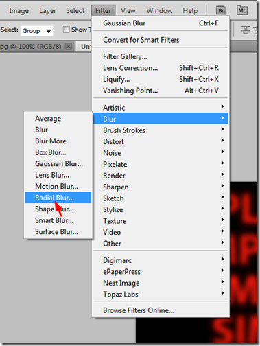
And after trying it several times, I decided to do it on a separate layer (use the same drag technique as for the text) and apply these settings:
Note that this dialog can take quite a while to pop up, so be patient. The amount of 21 gives us quite a nice blur and I would always use best quality because my machine does not take all day to calculate this, even though it is a mere Core 2 Duo, a little behind the times. But 3ghz and 8GB RAM make up for a lot of issues.
The result of these settings is a decent image:
And you could easily leave it like that. But I backed it off a tad to about 86% opacity:
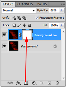
A subtle difference, but then the devil is always in the details. And finally, I decided to add a layer mask and expose the central word a bit better.
The mask is added by clicking the icon at the bottom of the layers panel:
Now, to reduce the effect of the blur on the text of the middle word, we click “d” to set default colors and make sure black is set as the foreground color again, then select the brush tool:
At the top of the window, you can set tool-specific values, and here we want a fairly low opacity so we can expose only enough of the lettering to make the word perfectly legible. 23% seemed to work well:
Just run the brush over the letters “S” and “LY” to slowly add gray to the mask. This makes the top layer more and more transparent, allowing the layer below to show through. And that is why you do these tricks on a layer. Between the opacity and the painting out of some of the effect, we now have exactly what we want:
Not quite identical to the original at the top, but close enough. For the original, I used a bit of a curve to juice the contrast … an I reduced opacity to get exactly what I wanted …
To get this:
That extra vividness is a matter of taste of course …
Layers and blur are powerful tools for creating interesting effects. You can, of course, perform such effects on real images and sometimes it adds a certain je ne sais quoi …


No comments:
Post a Comment