Tuesday, January 31, 2012

iPhone Glass Busted Again – It’s always something …

The 3G is pretty strong, but I have again managed to break the glass.


F300EXR 1600ISO f/3.5 1/17

This time, I apparently lay on it in my pocket and something must have been under it (I suspect a game controller.) Anyway, as you can see I’ve covered the bottom half of the glass in packing tape. Amazingly, there is no loss of performance, so I can go this way for a while.

In fact, I had planned to just leave it this way, but when I replaced translucent tape with this transparent tape, I shifted the pieces in such a way that they no longer fit. So I ordered the replacement last night. $12.42 shipped … these parts are ridiculously cheap.

You can also see the massive amount of dust lodged between the cover glass and the LCD, and I am very happy to be replacing it after all.

More when I receive the new part …

Monday, January 30, 2012

Topaz Star Effects – A cure for X10 ORBs?

A new toy from Topaz Labs. This one makes pretty star effects. of course, they already have lens effects as a plugin, but this is an easy way to squeeze a few more bucks out of the loyal customers :-)

Anyway, I thought I’d try out the one month free trial and the very first thing I noticed is how badly the preview matches the result. This is really annoying.

Preview (screen shot)

image

Result (screen shot)

image

Not even close. That’s a pain in the butt I think. Anyway … let’s put a little show together to see whether this is a temporary cure for ORBs on the X10.

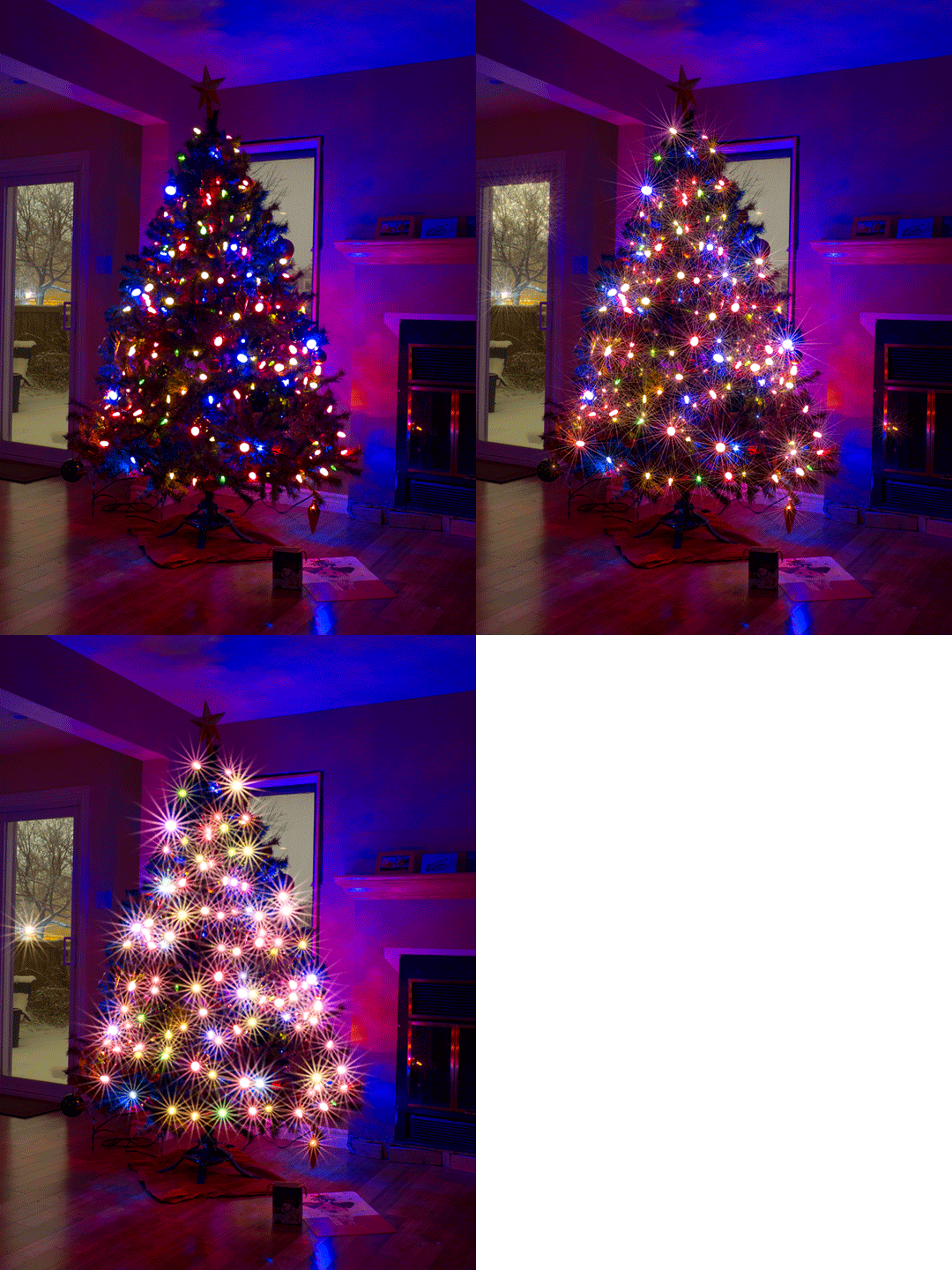
Here is the same shot from the X10 with massive ORBs present. This is an animated GIF with two other layers. One is a fairly subtle set of stars that make the image more palatable. The other is an ostentatious presentation of heavy stars that essentially eliminate the ORBs by increasing the point source to a larger dimension. This is the “spread” slider in action.

So it’s your call. Topaz Star Effects can certainly mask the ORBs when you turn it to 11 [Spinal Tap reference for those peeking out from their caves.] But in its more pleasing and subtle form, the ORBs are still there. Still, they are somewhat mitigate by the presence of so much extra light, so they look smaller in relation.

There are many settings, so experiment away.

Power corrupts …

Nick sent me a text that he just spent 15 minutes in Toronto getting reamed by a customs guy for not declaring a 40 cent package of curry sauce. Having flown back from a few weeks in the UK, one can easily imagine a package of curry sauce getting stuck in his bags at some point. The guy threatened him with a $1300 fine and, in Nick’s words, woudn’t STFU about this package of curry sauce.

Seriously.

Nick had to just stop talking after the guy continued screaming for a third trip around the circle when Nick had already explained it twice. He says that his rage at the injustice was approaching satanic levels. I can easily imagine this as mine gets close just hearing about it.

So this goes to show that those horrible stories about border guards and others who get a tiny smidgen of power over their fellow man and then abuse the shit out of it are real. I knew that already, because it has been proven more than once empirically.

By the way, the actual quotation is thus:

"Power tends to corrupt, and absolute power corrupts absolutely. Great men are almost always bad men."
                 
John Emerich Edward Dalberg Acton, first Baron Acton (1834–1902)

I would add that small men (in character) are just as likely to be bad men if they get a taste of power.

Sunday, January 29, 2012

Epic RAP Battle – Captain Kirk and Christopher Columbus

His-fricken-terical Smile

These guys deserve their 12 million plus views … this is what the YouTube people mean when they suggest that you post your own work. I’m impressed.

(I still think big media should go suck an egg for getting all medieval on people who like to post clips from concerts.)

Snow and Ice – The Morning After with D7000 and 70-300VR

So yesterday’s post was all about yet another in a series of seemingly daily snow squalls or soft flakes or whatever chooses to happen or fall. I shot the D7000 with the Tamron 28-75 2.8 and really enjoyed it.

Today, I was downstairs grabbing some breakfast when I noticed the light was almost perfect to capture the latest coating of snow and ice (sn’ice?) on various surfaces in my yard. So I ran upstairs and swapped the Tamron for the Nikon 70-300VR to get more reach and started shooting out of all my doors.

Starting with the patio door … the sub was coming through a layer of ice crystal clouds, so it was much subdued. The Yellow Twig Dogwood looks simply spectacular with ice and then a coat of snow. It looks like candy …

Backing out a bit, we can see the coating on the Annabelle Hydrangeas and the various bushes in behind them. Forsythia, False Spirea and so on.

Sidebar: I’ve come to a style here that I like best of all so far. I use minimal capture sharpening in ACR with neutral picture control and neutral contrast. Black point and white points set to spread the histogram out to the edges. I add a bit more contrast in CS5 and of course I use the narrowest output sharpening dialed down to taste after I resize.

The ice does not show up at the tips of the branches all that well, but you can certainly see it. The lights and branches in my neighbor’s back yard show nicely as well.

Here’s another attempt to capture the “crystal entity” look of the tips if the yellow twig branches. This one comes close to rendering the glitter.

Here we get a nice feel for the richness of the wood when the sun hits it directly. I nice complement to the yellow branches of the Dogwood.

The softness of the snow comes through here, as the staircase is almost full now. The wind keeps the eastern end of the pool free, though, so the vinyl can continue to take its yearly pounding. The eyes are cool … even thought they signal an impending liner replacement at about 3 grand.

The snow and ice coats everything. The vinyl backs of these chairs have been taking a pounding now for 14 years, and they are like new. They weren’t cheap at the time, but over 14 years they were a heck of a bargain.

The moiré you are likely seeing on your monitor is only there because of the reduction algorithm used for the blog. Click on the images to see them at 800px and they are clean and wicked sharp. The 70-300VR acquit itself magnificently.

Rather delicate details in the following image …

There is enough grain in the snow from all the rain that I am not really trying here for the fondant look. But I do like to retain the 3 dimensionality by ensuring that gradients are rendered.

This soft snow on dead flowers is a poignant reminder that we are cycling through the seasons and each is very temporary. That’s kind of depressing :-)

I love the depth in this next one. It really, really worked.

This one manages to convey less depth than the one above. This is the incredible thing about photography … two seemingly similar images have far different impact based on very subtle differences in composition, tone, etc.

Out to the front door and I’m shooting the yard and driveway to capture the mess the snow and rain have made of the streets. There was someone in the ditch (deep and filled with deep snow) for about 5 hours last night. It was amazing to see the car buried there just off the road about 500 feet from my house.

Anyway … the car renders really nicely here.

The snow clearing trucks continue to roll through the neighborhood. Right by my neighbor's tree.

My neighbor’s Blue Spruce in all its glory.

The sun came out much stronger so I popped to the back yard again and shot this image of the Yellow Twig Dogwood. I think the softer lit ones work much better. As is always true. Sunlight sucks the color and tone out of almost any image. I’ve done what I could with this and I like it. But I like the ones above better.

So ... snow is predicted for many more days in the coming weeks, so I won’t get too excited about the nice temperatures. We’re hovering all the time around 1 degree and that has mercifully resulted in more rain than freezing rain. But we’ve had enough of both for a while.

I shot all of these images in live view mode by the way. I really like live view mode because contrast detect focus is quick enough and generally gets the sharpest possible images in good light.

Saturday, January 28, 2012

Fun with Data – How many earthquakes were there last week, worldwide? ** Updated

Updated on 29 Jan 2012

I’ve been reading a book this week called Learning SPARQL, shown at left. This book is an absolute steal in its Kindle edition. For less than 10 bucks, it provides a useful introduction into the world of RDF – Resource Description Framework.

This is a model for information that provides an incredibly flexible way to describe things and SPARQL is the query language that is used to get answers to questions about datasets that are expressed in RDF. The basic concept is the “triple”, which – expressed trivially – is a single fact about a thing.

So, for example, a fact might be that Ginger has red hair.

And since a triple is made up of three (duh) parts, we can formally describe that fact as Subject=Ginger, Predicate=HairColor, and Object=Red. This is not in any known RDF format; it is just a simple way of illustrating the power of modeling data that way.

There is a related concept called “linked data”, which really just means that you can link datasets together by some common value. Much like databases and their foreign keys. But URLs are pretty much ubiquitous, since the World Wide Web uses them to hyperlink pages together. To steal a phrase from the book, it wouldn’t be much of a web without links.

And there are SPARQL end points that allow you to query data sets over the web and get results back in a requested format, e.g. HTML, RDF/XML, JSON, etc. Some pretty cool stuff in there.

And so we arrive at the earthquakes. To quote from Learning SPARQL:

Professor Jim Hendler and his Tetherless World Constellation group at Rensselaer Polytechnic Institute converted a lot of the simpler data that they found through the US Data.gov project to RDF so that they could build semantic web applications around it. After seeing this work, US CIO Vivek Kundra appointed Hendler the “Internet Web Expert” for Data.gov.

DuCharme, Bob (2011-07-14). Learning SPARQL (p. 42). OReilly Media - A. Kindle Edition.

There is a lot of free data available on the Internet, it turns out. After reading this quote, I popped over to http://data.gov and found a menu that offered to let me explore some raw data.

image

Clicking on that menu item brings you to a list of datasets. I liked the first one on the list.

image

So I went there and found that I could download the dataset in a very familiar format – CSV.

image

This is, of course, a simple delimited text data format (comma separated in this case) that is presented in your browser like this:

Src,Eqid,Version,Datetime,Lat,Lon,Magnitude,Depth,NST,Region
nn,00366555,8,"Saturday, January 28, 2012 14:03:51 UTC",39.3858,
-119.9548,1.4,8.50,22,"Nevada"
ak,10399820,1,"Saturday, January 28, 2012 13:21:59 UTC",61.0241,
-152.2186,1.4,99.80,11,"Southern Alaska"
nn,00366553,8,"Saturday, January 28, 2012 13:12:18 UTC",38.2277,
-118.8112,1.2,18.70,10,"Nevada"

Interesting stuff, but not very useful in this form. So I copied the URL in the browser address area:


http://earthquake.usgs.gov/earthquakes/catalogs/eqs7day-M1.txt


And pasted it into the file selection dialog of the open menu item for Excel 2007.


image


(You did know that you can use URLs in any most situations where you normally select local files, right?) When I do that, Excel recognizes the dataset format and asks me how it is delimited.


image


image


Selecting delimited and comma does the trick. It loads in a rather unpleasant format, obviously.


image


But I quickly got it into something more palatable.


image


So what can you do with these data sets in such a simple format? Well, quite a lot, actually. Some questions and their answers:


How many earthquakes were there world-wide in the last 7 days?


image


Subtract 1 for the header row and the answer is 1014. I’ll bet most people would not believe that number happens in a week, but it does.


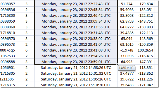
How many earthquakes were there last Monday, January 23rd?


image


After sorting, you select the first instance of the 23rd, scroll down, and while holding the shift key you select the last instance, thus selecting them all. You get the answer while holding the keys down:

image


148 rows means 148 earthquakes last Monday.


If you let go of the keys and that little tool tip disappeared, have no fear. The count is still visible for any selected area:


image


Note: There are much more sophisticated ways of exploring these data, even in Excel. I’m showing you brute force techniques so you can see how much information is expressed here without hiding it behind techniques with which you (or I) might not be familiar.


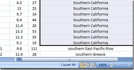
How many earthquakes occurred in Southern California last week?


image


image


That would be 95.


How many of those earthquakes were strong enough to be felt?


Here, we have to look up the Richter Scale to see what magnitudes can be felt.
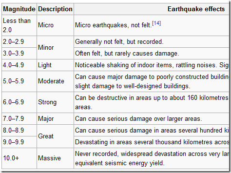

image


Obviously, we must now search for all quakes magnitude 3.0 or greater. This gives as a list of the earthquakes that could have been felt, had someone been near enough the epicenter. If a tree falls …


Now, looking back at the sort I performed for the previous question, you will see that I also sorted in descending order by magnitude after I sorted by region. A method to my madness …


image


Looking at the dataset with that sort applied gives us the answer: zero. No one felt an earthquake in southern California last week because the highest recorded quake was magnitude 2.8. Of course, if one were standing right on top of the epicenter, that’s close enough that perhaps a slight tremor would be felt. But that’s not the point of the exercise. Pick your rules and query your data. The answers are accurate enough to be perfectly useful.


One final series of questions …


How many earthquakes were there in Canada last week?


Let’s use the search function to find all occurrences of Canada.


image


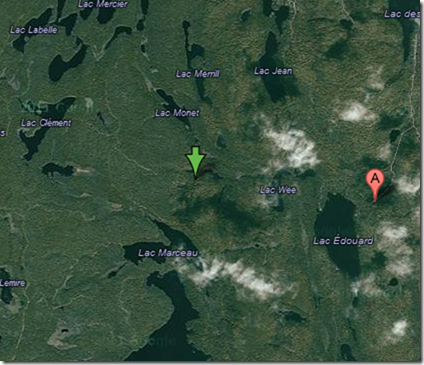
There was but one, in southern Quebec. Hey, that might be fairly close to where I live. Let’s just see how far away the epicenter was from me. Well, first let’s see where it was in the first place.


I tried the following trick without knowing whether it would work at all.


Copy the latitude and longitude and paste into Google maps:


image


image


It works! You get a point on the map showing the lat and long and you get the nearest address on a street or highway.

image


That’s very cool. We’re starting to extend the value of the data rather far. Let’s continue …


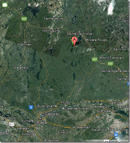
How  far is that from Ottawa, approximately?


Not very …

image


Driving it is a little circuitous:


image


But that tells us that the approximate 200km distance is less than the directions say ot is by quite a bit …


image


As a 3.2 magnitude, those in cottages nearby should have felt it a little bit. But it was much too far away from Ottawa for any of us to have felt it.


Conclusion


This little brute force exploration of a simple dataset from the US government shows you just how much you can learn from poking around in this stuff. If you wanted to build up your own database for this information, and you had only Excel, you could download it each day, paste it into the master spread sheet, sort it and then tell Excel to eliminate duplicate lines.


Of course, the full dataset is probably sitting on the end of a SPARQL end point somewhere, just waiting to be queried. But the point is that there is tons of free data out there and you can do a whole lot without any sophisticated tools.


Have fun.


Addendum 1 – Distance from the quake to me


My friend Sue posted a couple of responses that contained the actual distance of the Canada earthquake from last week to my suburb. And that distance was a mere 126km, or 78 miles as the crow flies.


image


That’s not far at all. Still, I felt nothing, so it must be far enough to prevent even a gentle swaying from being noticed.


Her other response contained a superb link to a Google site containing the formulas and a calculator for distance between two points described by their Latitude and Longitude. Very cool.


http://www.ig.utexas.edu/outreach/googleearth/latlong.html


Addendum 2 – Of the 1014 earthquakes last week, how many were strong enough to be felt?


image


Ignore the datetime subsort … we won’t be using it and sorting alphabetically reverses the natural date order of Thursday and Friday for example :-)


image


Only 141. That’s fewer than I might have thought.

Snow Squall – D7000 and Tamron 28-75 2.8

I happened to have the D7000 with me recently when a snow squall hit rather suddenly while standing in a parking lot with the trunk opened. I took the D7000 out and shot a few images. I love the look of snow lining branches, and I like to try to capture the ambience of a snow squall.

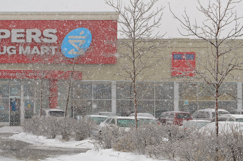
Obviously, I shoot RAW, which means that I choose everything about the final image, and the contrast is the primary setting you need to render the snow squall as it really feels. The problem is that the image is washed out and there is no detail, so I am always tempted to add contrast and draw down the black point in order to pull out details. I did that for the first image I shot and I have to admit that, although the detail is superb, the image just looks wrong. It was much harder to see the building …

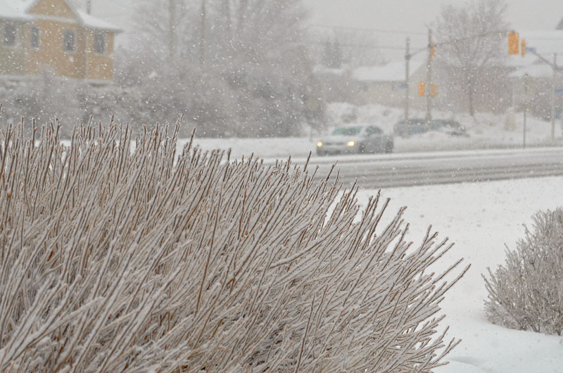
The next image is more accurate, because I was standing fairly close to the bushes and so there was less haze in the air from the heavy snow flakes.

Stepping back to frame the street as well shows better how the snow was fogging things up.

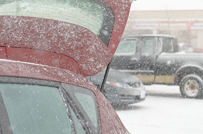
Since I was standing next to the front of the car, I simply turned around and caught the raised hatch with snow starting to pile up. heavy stuff still falling …

I love the clarity on this lens.

Sidebar: Why the 28-75 focal length? That’s not very friendly to APS-C sensors, since the EFL is actually 42-112.5mm. But in fact this is a superbly sharp lens, much like its sister lens for APS-C, the 17-50 … but not the variant with VC (vibration compensation.) This and the non-VC 17-50 are extremely sharp lenses and a pleasure to shoot. I do plan to replace this lens (or augment it) with the 17-50, which would become my walk around lens of choice.

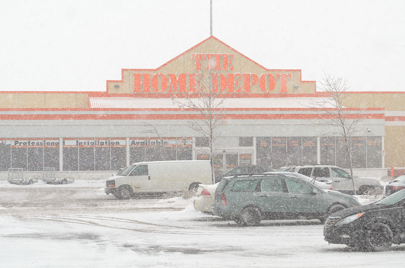
Here’s a straight on view of the Home Depot, which forms an “L” with the Shopper’s Drug Mart, sharing a parking lot.

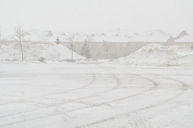
Turning to the right, I now face approximately west (ish) towards the town houses that adjoin this lot.

Turning 180 degrees again to face the drug mart, I capture a much better image. Or at least I produce a better image by allowing the contrast to back off a bit so that the snow dominates as it does when you are in it …

So when you process snow images, remember to recreate the fog effect of snow by backing the contrast off a bit from your normal amount.